Hirosaki "Apple Town" Promotion by M Zaruba from usa
designer's own words:
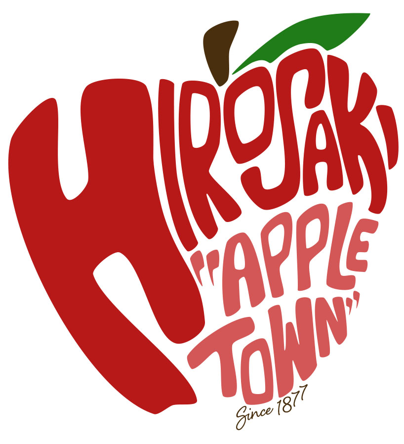
Through my design, the shape of the apple is created using typography. I made the name of the city, Hirosaki, the main emphasis inside the apple by using a very vibrant red. I then added the city’s nickname of “Apple Town” below in a lighter red to push the city’s industry but, not take away from Hirosaki featured above. I chose to use red for the apple’s body because the majority of apples produced in the Aomori Prefecture are red. I also added a green leaf to the apple, to not only promote a healthy look, but also to allude to the minute amount of green apples in the region as well. Featured on the bottom is a small tagline stating “Since 1877” because this is the year when apple production started in Hirosaki and the surrounding Aomori Prefecture. All together I think the design embodies the city of Hirosaki as a whole.
The apple was created to be used as a promotional design for the city. It would look best as a sticker (regular, vinyl etc.), t-shirt, drawstring bag or tote. I have also shown it as other items including a phone case, laptop skin and notebook to show the versatility of the design.
Hirosaki “Apple Town” Full Promotional Design
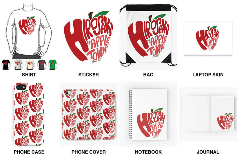
Hirosaki “Apple Town” Mockups of the design’s versatility.