LETTERS FORMING A LOGO TO GIVE BIRTH TO AN ICONIC BRAND by pareshanand acharya from india
designer's own words:
The logo shows a flying bird showing a growth and progression to the ‘next level of success’. The logo appears to be lively, flexible and energetic to serve the target consumers & also to adapt to the trends (to convince the newer generations or new audience). The form is simple and easy to understand . Moreover letter M & S are emphasized followed by other letters of Moleskinerie . The letter M is capsuled in a circle so as to reveal that the quality & brand character is: controlled, systematic, ethical, age old experienced and to feel the depth through generations.
The thought process was that, ' how do we make the brand iconic ?'. How do we help the consumer to recall and relate ? How can we show the depth of our experience and how we grow delivering the best ? The answer was to make it simplest possible.
LOGO ICON WITH LOGO TYPE
 LOGO ICON
 LOGO DARK BACK GROUND
 LOGO TYPE OPTION
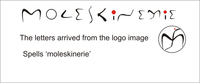 LETTERS FROM THE LOGO
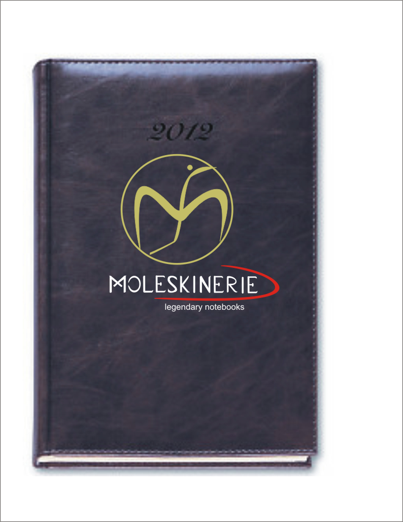 IMPLEMENTATION ON DIARY