
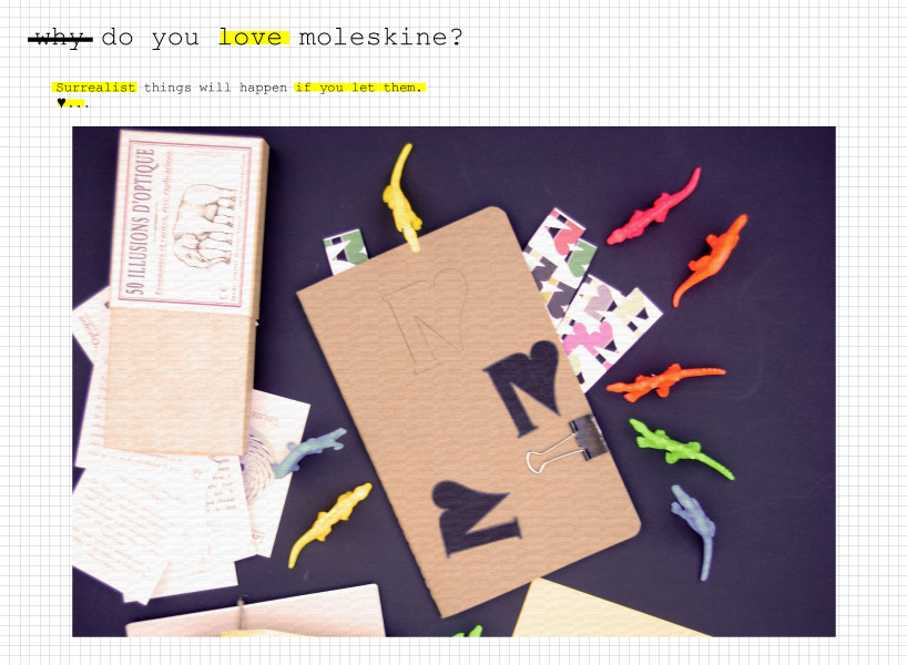
loveskine rie by ana martinez from spain
designer's own words:
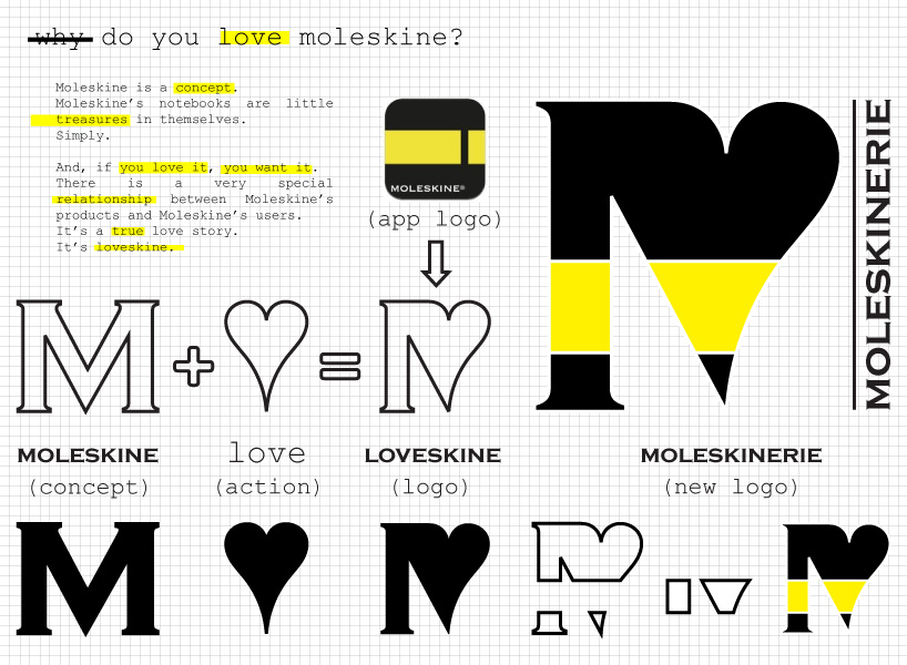
there is a very special relationship between Moleskine’s products and Moleskine’s users.
It’s loveskine.
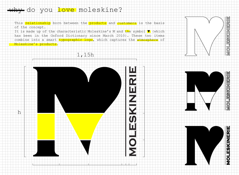
this relationship born between the products and customers is the basis of the concept.
It is made up of the characteristic moleskine’s 'm' and the symbol g (which has been in the oxford dictionary since march 2010). these two items combine into a smart typographic logo, which captures the atmosphere of moleskine’s products.
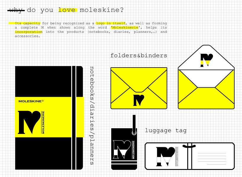
its capacity for being recognized as a logo in itself, as well as forming a complete 'm' when shown along the word 'moleskinerie', helps its incorporation into the products (notebooks, diaries, planners,…) and accessories.
loveskine story
 concept
 logo
logo
 incorporation into the products
 incorporation into the apps
 loveskine-rie