lvqr 90th anniversary pseudo pop design by philippe gilbert-poisson from canada
designer's own words:
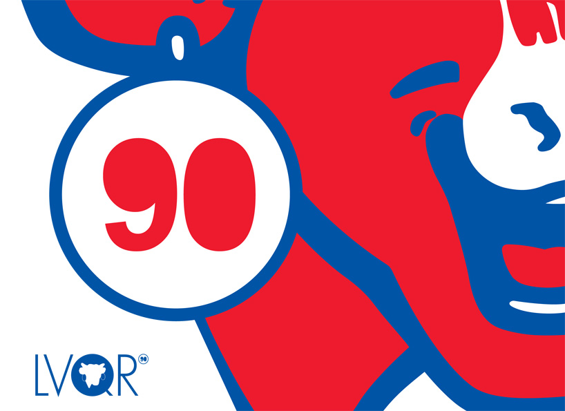
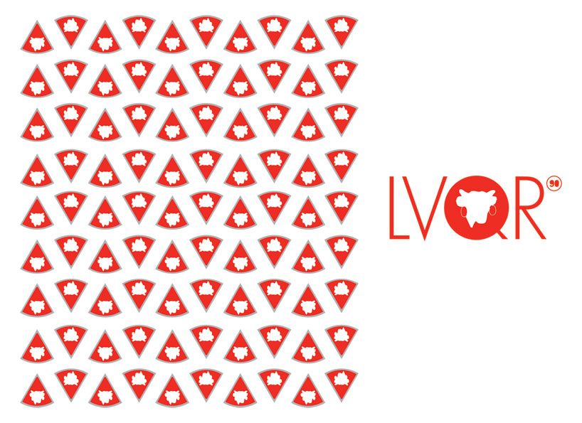
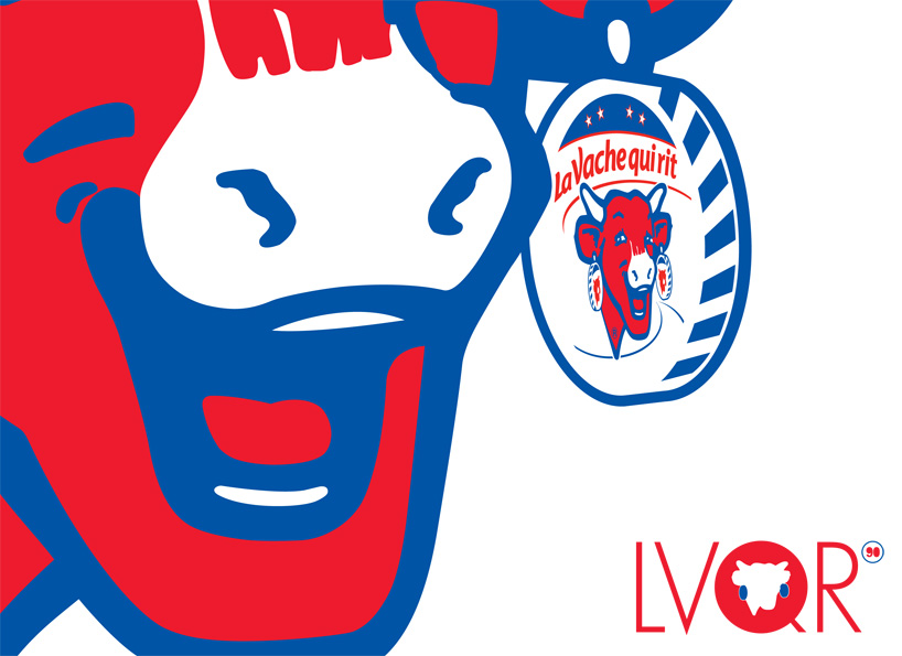
i came up with 3 designs. for design 1, i really wanted to focus on her iconic smile. it's not "la vache" but "la vache qui rit". replacing the black outline of the cow with the blue made it really pop. the two colours were used on the logo as well to bring everything together. for design 2, i wanted to focus more on her landmark anniversary while making sure to show enough of the cow to know exactly what product this is for. her earring has been replaced with the 90 part of the lvqr 90th logo. finally, my idea for design 3 was to use the iconic shape that the cheese is packaged in. there are 90 pieces representing 90 years. red and silver were used here, but it would also work well with the blue replacing the red. this design is very modern and quite symmetrical.