M for moleskinerie by kareem hawash from syria
designer's own words:
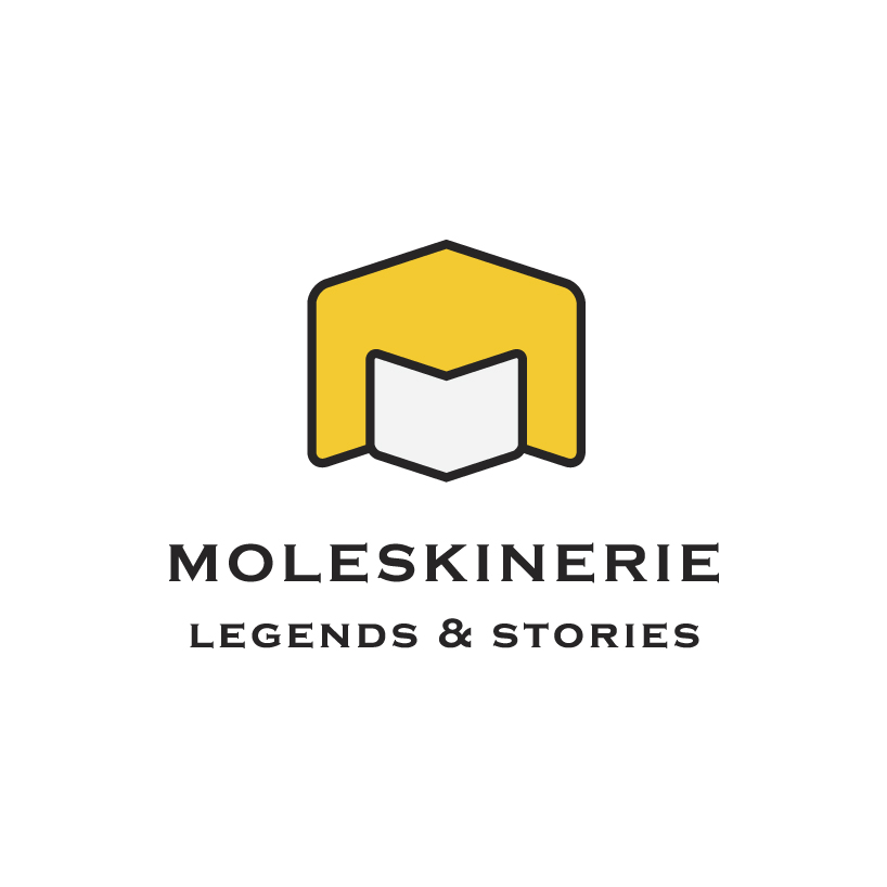
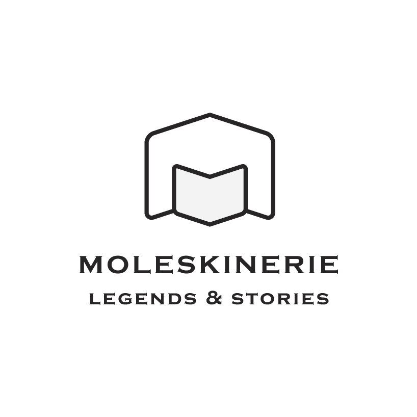
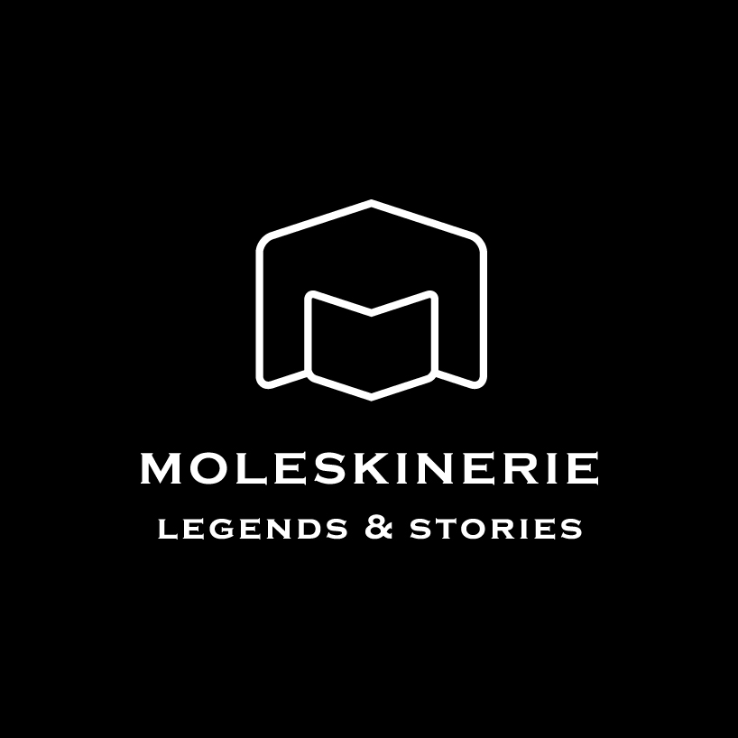
m for moleskine, really simple idea by imagined two different sizes of moleskine products opened, by putting them facing each other we can get the letter m, which is the initial of moleskine logo.
a simple outlined moleskine product opened and facing each other
if we subscribing them from each other we can get the letter m, the coloured version of the logo is bright to be more eye catching, and focusing on the m letter.
and the B&W version is very simple, an outline symbol which reflect the m letter and the two opened moleskine products facing each other in a simple black and white outline.
coloured moelskinerie logo
 B&W moleskinerie (black)
 B&W moleskinerie (white)
shortlisted entries (2162)