Mary Kwan _ THE STRIPE
by mary ka man kwan from uk
designer's own words:
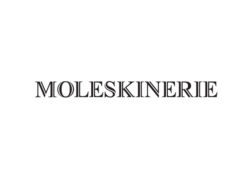
I have started the project by looking at some classic font type in order to reflect the brand image, with detailing and a bit of modern twist, here is the final outcome of ''THE STRIPE". It fully reflects the iconic details of the brand where consumer could instantly relate the logo with the branding behind.
The Serif font reflects the iconic brand with classic unique identity. With a single stripe on the right hand side, it highlighted a signature details of the brand.
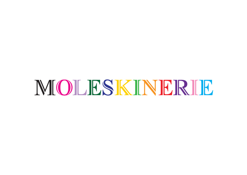
Variation of colors can be applied on different alphabets to celebrate the creativity of the consumer who use the product.
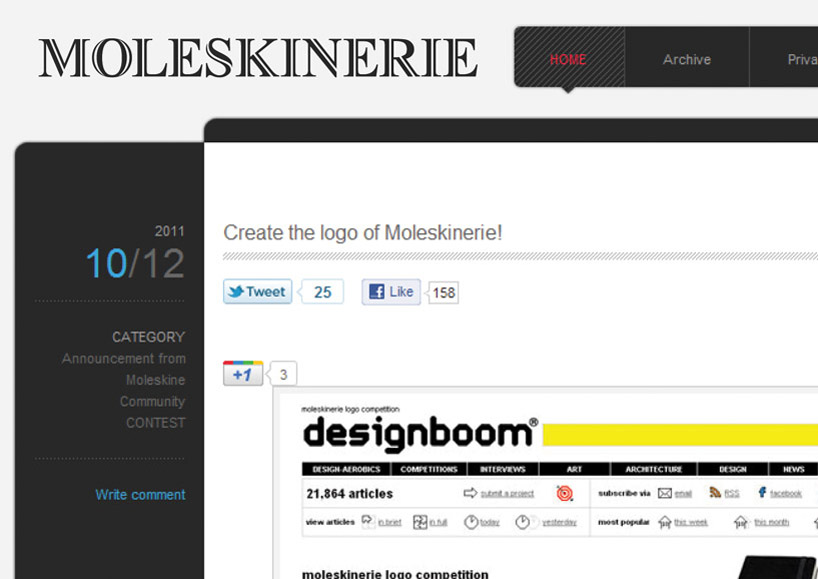
Logo on the current web page.
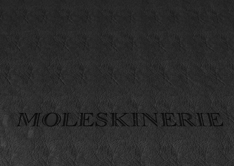
Details of engraving.
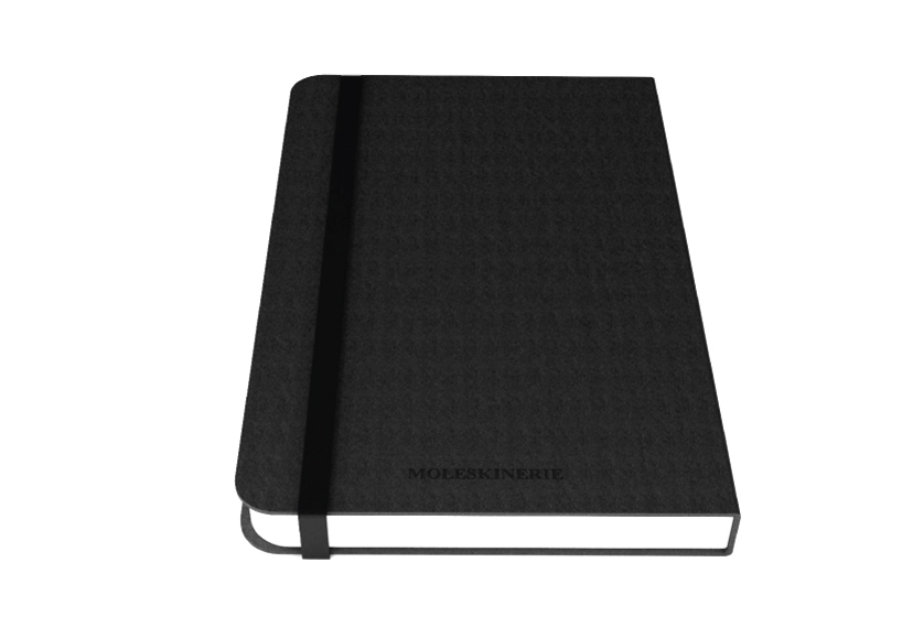
Signature engraving on the notebook.
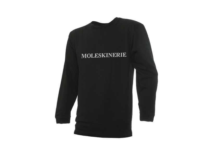
Logo printed on tee-shirt.