MEEE by ovi deh from austria
designer's own words:
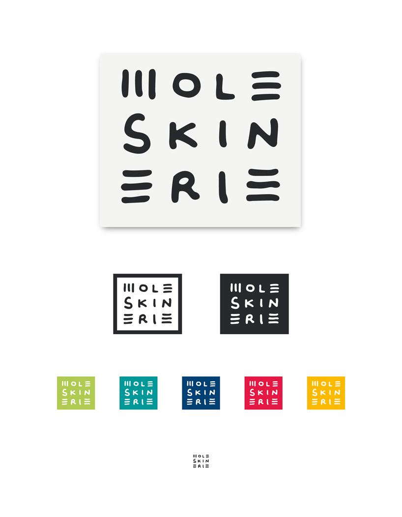
first i had the idea to do a simple handwritten typographic logo, without a symbol, just the characteristics of my handwriting. after many pages of scribbles, i devided the word "moleskinerie" into 3 groups MOLE-SKIN-ERIE, and did some even designs with the letters.
in this form the word bacame more compact, and was easier to read. i draw the MEEE in the 4 corners only in strokes, to make it more solid, at the same time giving it more character.
the final logo itself is not dynamic like a handwritten word would be, but after some thought i decided that it dont has to be. the sketchbook by moleskin itself is simple but distinct. the logo has a handmade touch but is not agitated in any way. tough as nails, in any situation imaginable.
shortlisted entries (2162)