moleskine logo1 travels
by Ivonne Salinas from mexico
designer's own words:
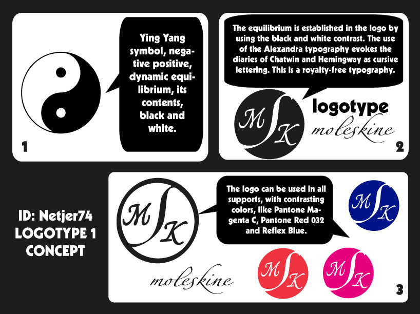
The equilibrium is established in the logo by using the black and white contrast. The use of the Alexandra typography evokes the diaries of Chatwin and Hemingway as cursive lettering. I use digital support at Illustrator CS5 and sketchs previews.
logo concept
aplications