Moleskine made
by matteo carrubba from italy
designer's own words:
CONCEPT: communicate the archetype of the moleskine notebook right from the logo - have an iconic element that can be used toghether with the logotype but also alone, still keeping recocgnizability and character.
KEY FEATURES: flexibilty on the application - a little visual trick in order to be more memorable - same font set as moleskine logo in order to force connection to the mother brand - use of shadows and color gradients to enrich digital experience as primary usage.
Logo for high quality print – standard version
Detail of the logomark
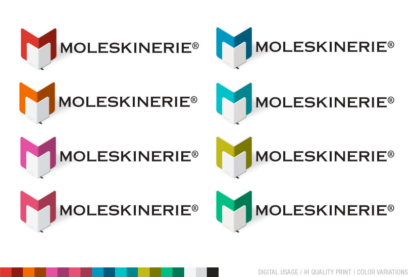
Color variation for brand architetcture variations
one color versions for silkscreen print
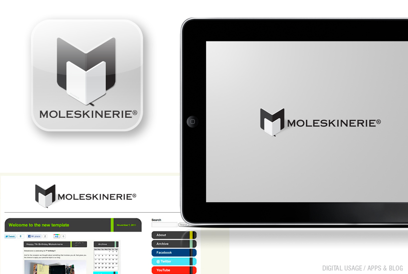
Logo application on digital media
Logo for high quality print – standard version inverted