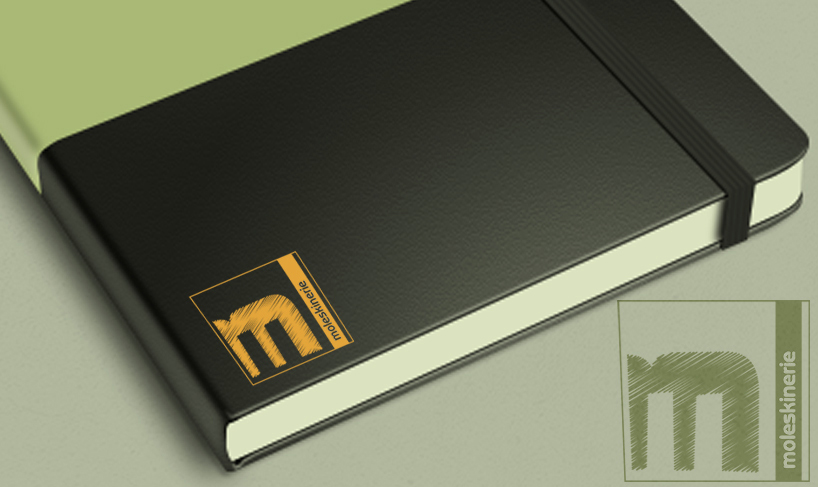
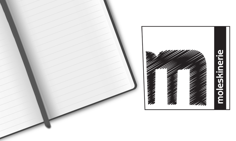
moleskinerie 1 by pedro regadas from portugal
designer's own words:
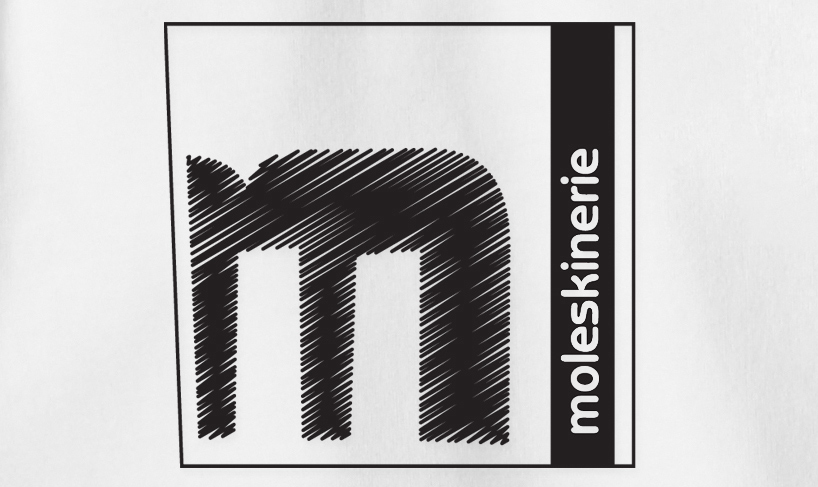
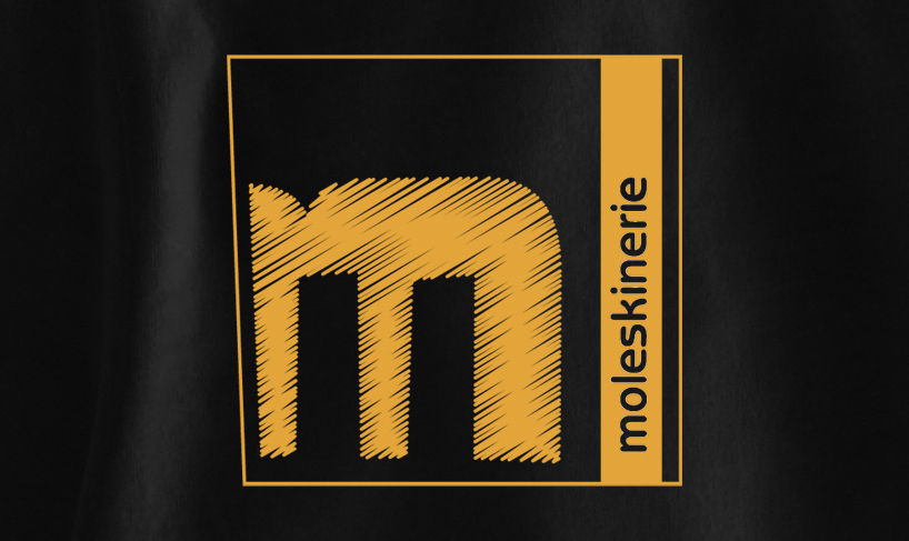
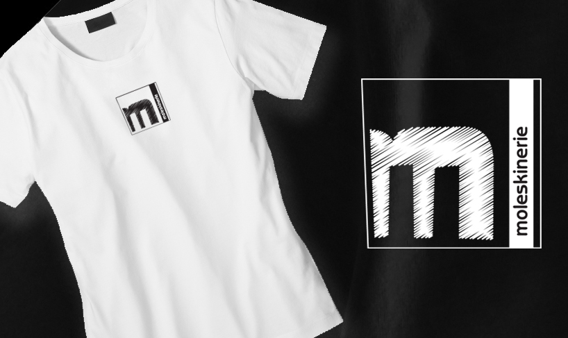
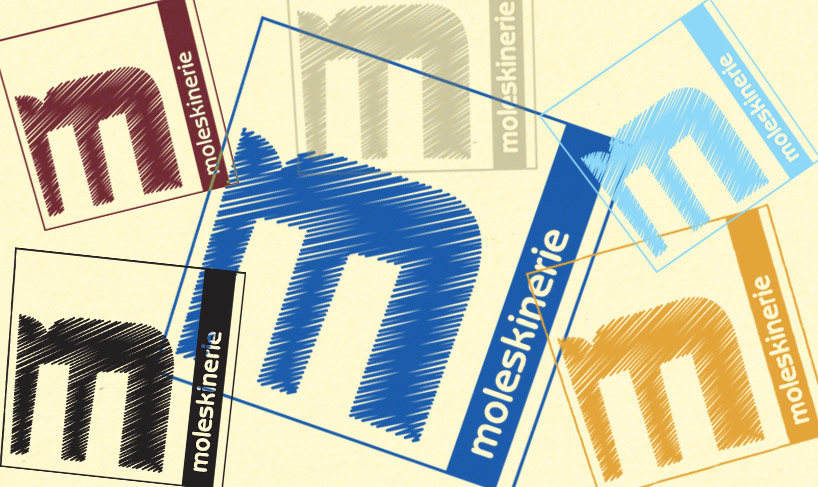
the logo was based on a scribble of a pen on a piece of the moleskine. the "m" has a look of handmade. the letter "m" is inserted into an irregular square crossed on right side by a rectangle with the word "moleskinerie." this representation resembles the image of a moleskine notebook. the logo is very versatile, could be adjusted to any scale and color. easy to print, stamp and work very fine in digital environments.
shortlisted entries (2162)