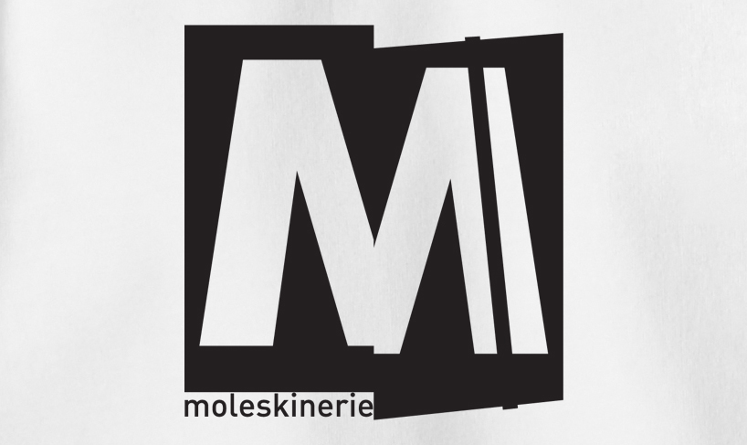
moleskinerie 2 by pedro regadas from portugal
designer's own words:
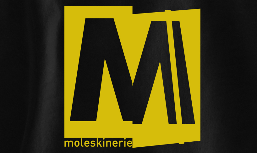
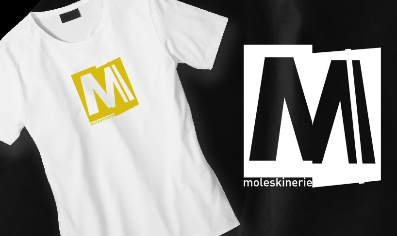
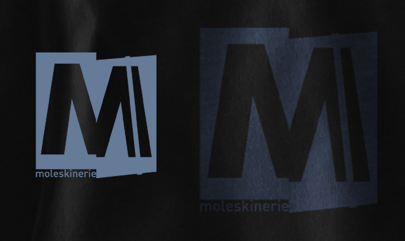
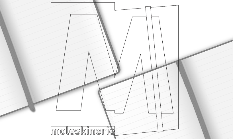
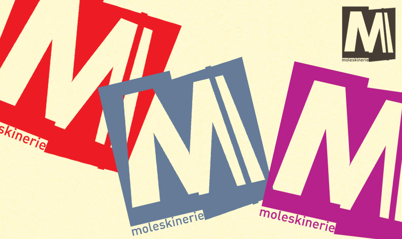
the logo is composed by an irregular square shape that resembles an open moleskine notebook. on center is a “m” letter, that follows the geometry and dynamics of the outer square shape. the typical notebooks elastic is represented on the right side to improve the moleskine image association. the text “moleskinerie” appear in the left corner. the logo has a strong image easily associated to the moleskine products.versitile, could adopt any color or scale.
shortlisted entries (2162)