
moleskinerie burst by phil scorza from usa
designer's own words:
my design incorporates a stylized "m" in addition to the word moleskinerie spelled out. i also show that either of these two components can stand alone or used together so there is the ability to adjust the brand mark to the object it appears on. the second "i" has been made into an exclamation point to give the design some action or volume. i used bright colors since the current packaging for the product line tends to be bright and colorful. this submission will look clean if reproduced in a single color, reversed out in black or other color field and it is designed to be multifunctional. let me know if you would like to see any additional versions. thx
the m burst icon
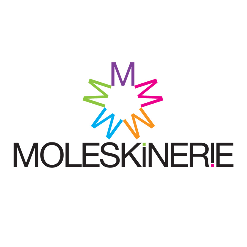 logo stacked
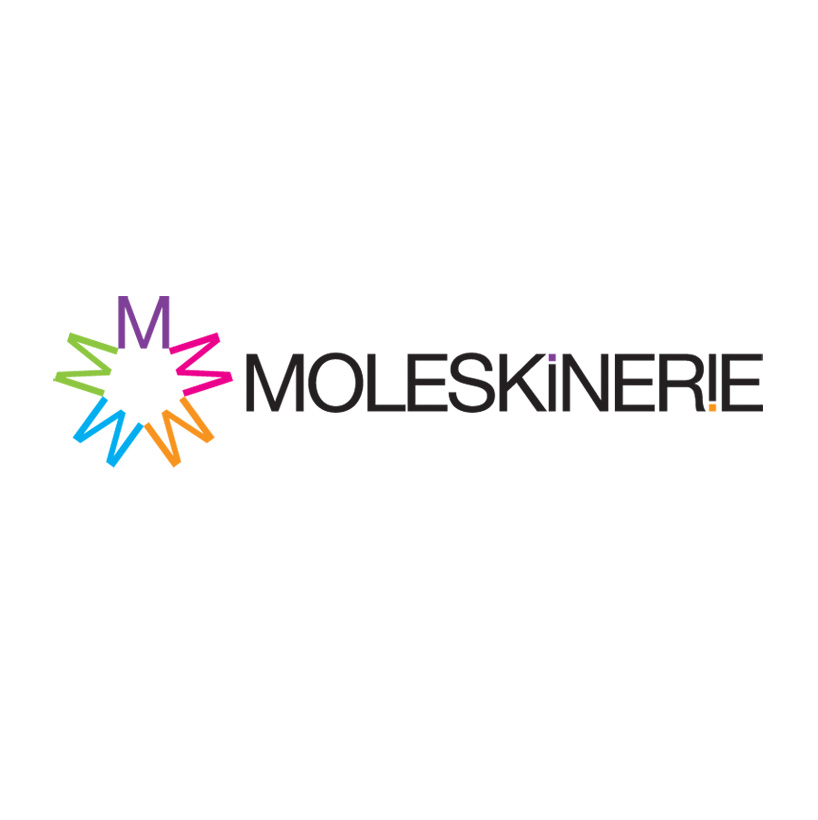 logo horizontal
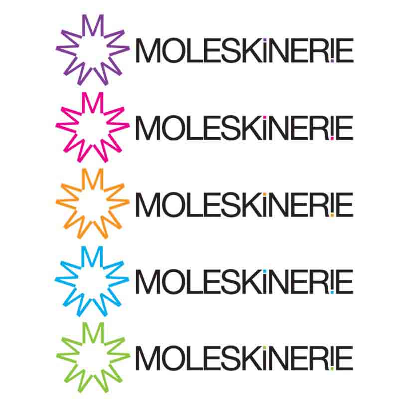 variable color
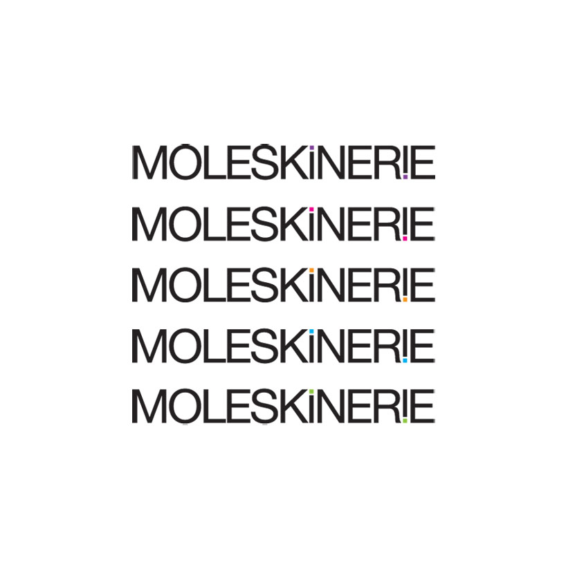 without burst
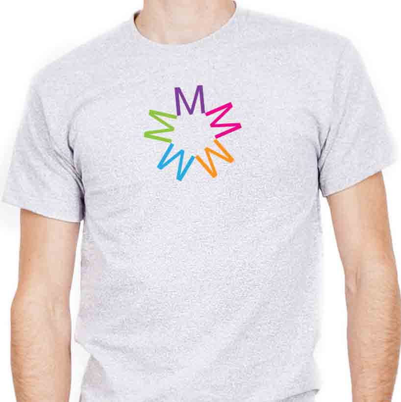 burst on a shirt