Moleskinerie logo suggestions by harris aidonopoulos from uk
designer's own words:
my proposals are three completely different approaches to the brief given. proposal 01 is more based on the unique shape of the notebook itself, forming the letter 'm' and could stand by itself as a symbol. proposal 02 uses the elastic band to divide the word 'moleskinerie' but at the same time stresses the unity of moleskine with moleskinerie. proposal 03 is mainly the capital 'm' with the elastic band strategically positioned on the exact same point of the actual thing. as far as the colour selection is concerned, things are kept simple, using mainly black and on the first case the green used by moleskine on the packaging of the notebooks.
Logo_01
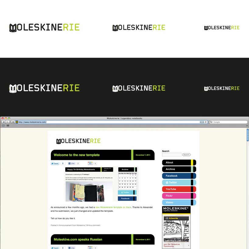 Applications_01
![]() Logo_02
Logo_02
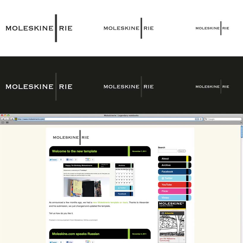 Applications_02
![]() Logo_03
Logo_03
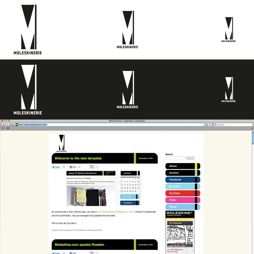 Applications_03
shortlisted entries (2162)