Moleskinerie logodesign by K1rsche by Mirco Kirsch from germany
designer's own words:
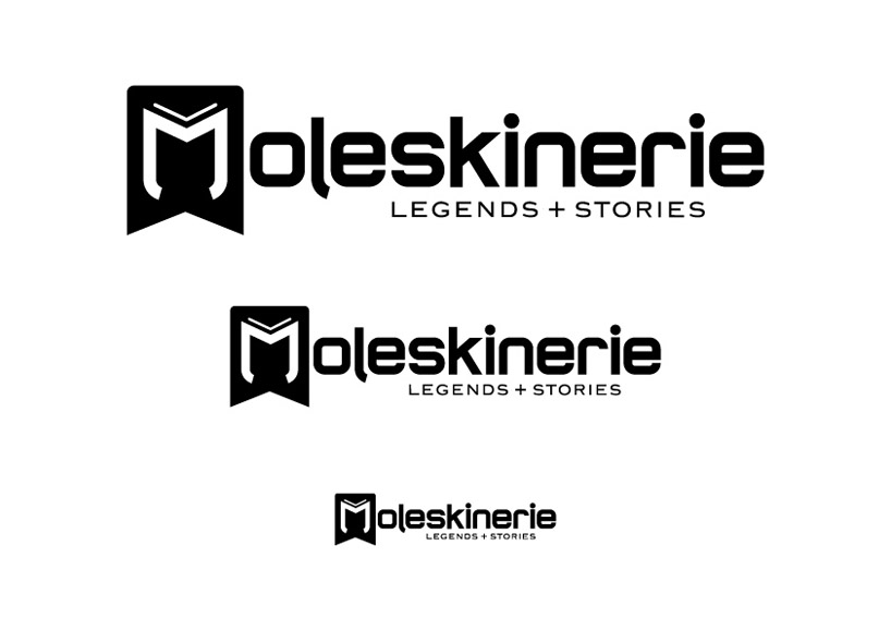
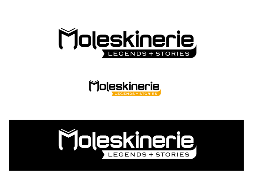
The notebook still remains on the vital element of the business. You can see this in the logodesign. The letter "M" illustrates clearly an open book. The bolded character of the font is clearly legible on screen and attracts attention. The typography for "legends + stories" is inspired by the typography of the Moleskine logo.
Further elements such as the rounded book edges and the bookmark are also reflected in the logodesign.
As well as the book, the logo has been reduced to the essential and stands out with its clear design.
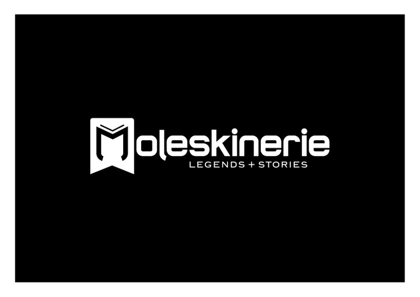
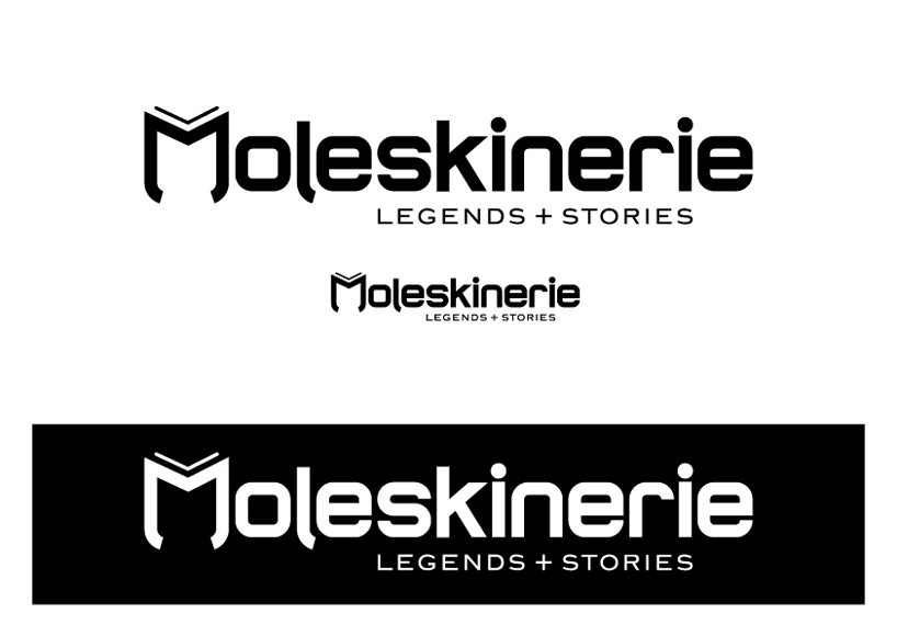
The logo works well in black and white and works in all mediums.
The "M" in Moleskinerie can be used as icon in many ways.
Different sizes
 Invers
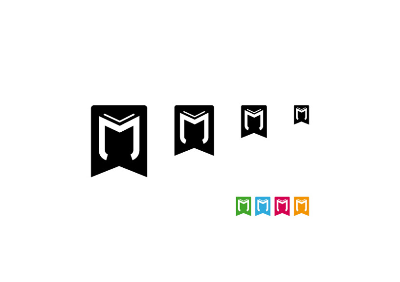 The Icon
 Another way more simple
 Another way much more simple
shortlisted entries (2162)