moleskine(rie) reloaded
by harris aidonopoulos from uk
designer's own words:
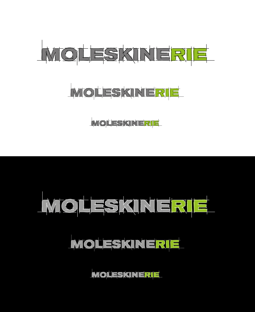
proposal 01 creates the logo using a sketching grid for the letters and a free hand filling with colour, grey for the 'moleskine' part and lime green for the the '-rie'. in this way the main use of the brand represented is stated clearly but gives chances for more. on proposal 02, the actual typeface of moleskine is used, but with a twist. the letters are revealed by sketching-out strokes. strict and established, as the moleskine brand, but at the same time in a playful mood. on both cases the second colour used (apart from sades of black) is lime green, a colour strongly related to the name of moleskine from its packaging.
moleskinerie_suggestion1
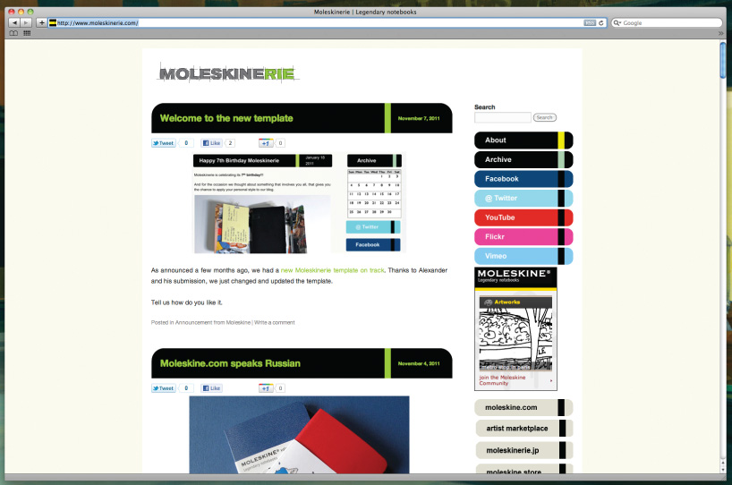
moleskinerie_application1
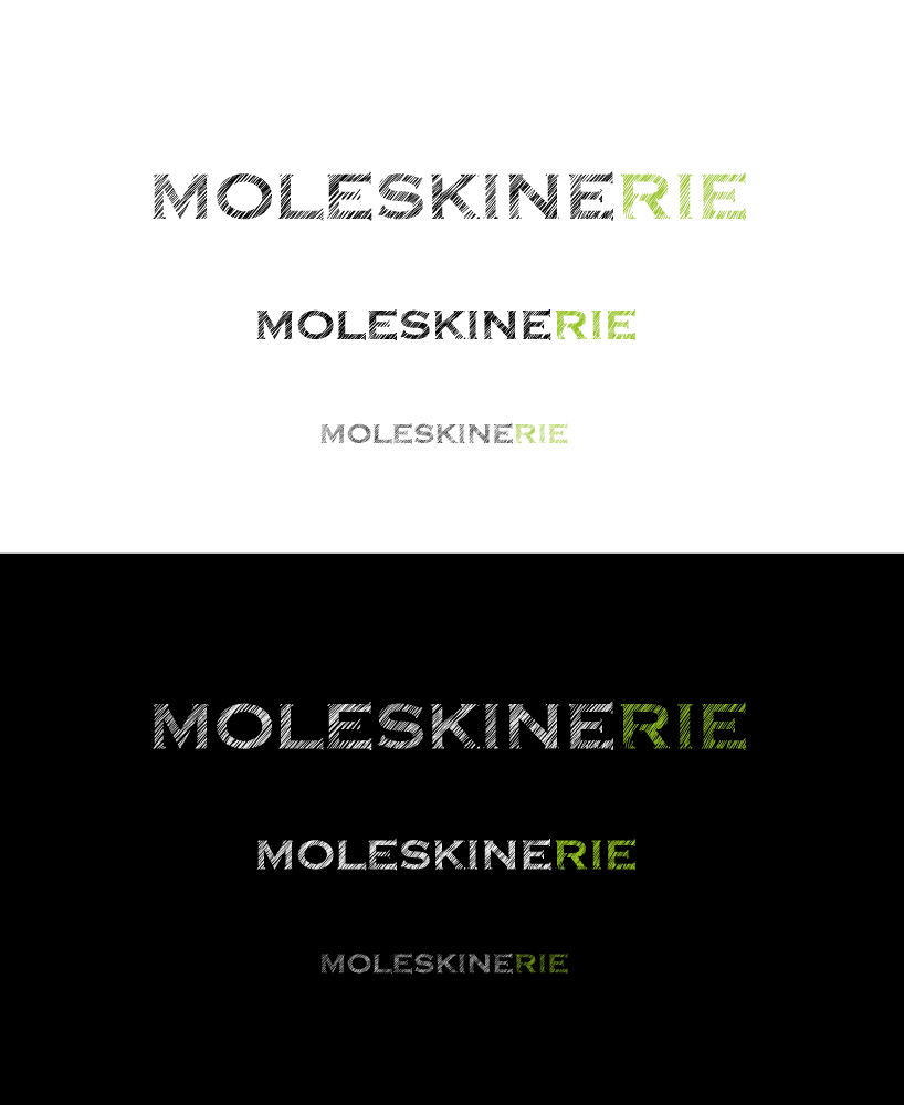
moleskinerie_suggestion2
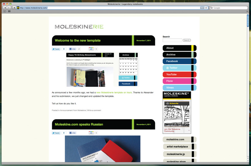
moleskinerie_application2