more than words by francesco ciardi from italy
designer's own words:
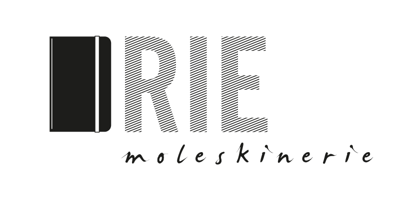
you don't need words to describe an icon. just show it.
the concept behind this logo is that moleskine has become sooooo much an icon that the best way to summarize and represent it is to replace the letters with the renowned black cover.
it's a sort of a rebus, a trick to intrigue the user's mind, and at the same time a tribute to the most iconic sketchbook in the whole world.
Of course the logotype has to be handwrited in an easy, informal way, like the way you use your moleskine.
shortlisted entries (2162)