mr clean by gorana marsic from croatia
designer's own words:
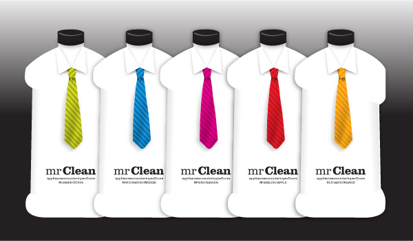
project 1 (MR-07-01-Packaging-TIE-001,002.jpg)
Our main goal was to design a cleaning product which would be different to all other cleaning brands on the market. The illustration of the tie clearly indicates Mr Clean, the name of the product. The idea is unexpected and with its unique look it attracts the buyer; making it a fun and exciting shopping spree. Mr Clean- cleaning products differ from one another by the color applied on the tie. Finally, the characteristics of the font are simple and sophisticated and therefore make it a real gentleman's font.
project 2 (MR-07-01-Packaging-CLEAN-001.jpg)
This design clearly speak purity and freshness. The dominant white space indicates perfect clarity as it should
be in ones home. Colors used on the packaging are mainly in primary tones which gives them an overall FRESH look.
The products differ from one another by the different color used on the font. Additionally, the font is very simple and therefore provide good legibility. Mr Clean has a reflection under the font which gives the product an extra feel of cleanliness. As the design consists of only two colors the overall product becomes very economic.
from t-shirt to tie, this design successfully re-brands 'mr. clean',
for an up-scale market, by adding a formal touch to the brand.
MR-07-01-Packaging-TIE-001.jpg
 MR-07-01-Packaging-TIE-002.jpg
 MR-07-01-Packaging-CLEAN-001.jpg