
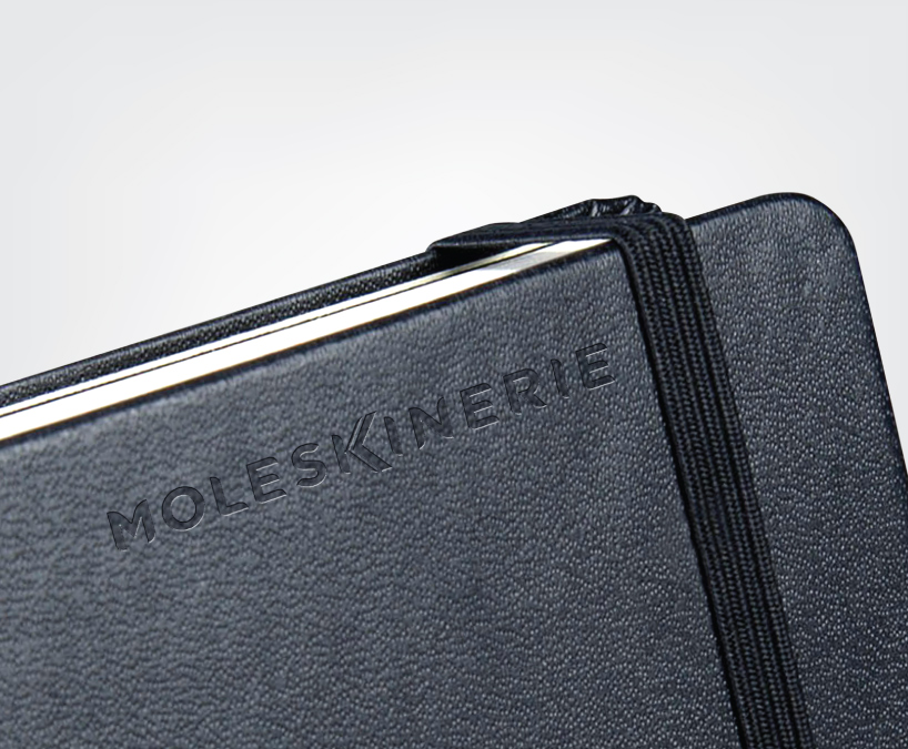
new logo for moleskinerie
by aneeshvini aneesh from india
designer's own words:
a single distinctive element always sets a design apart. the hands of the alphabet ‘k’ symbolizes the proverbial open book, and that which Moleskine is best known for. The spine of the book rests on the stalk of the alphabet, almost as if to assure that everything you put into it is safe. something that is vital, because the process of writing down one’s thoughts is a very personal thing. furthermore, every alphabet in the unit has a rounded edge, similar to the pages of a book when in the state of a static flip. All in all, the unit aims to speak in a quiet, intellectual tone saying everything it has to and more with a sense of elegant dignity.
Refference
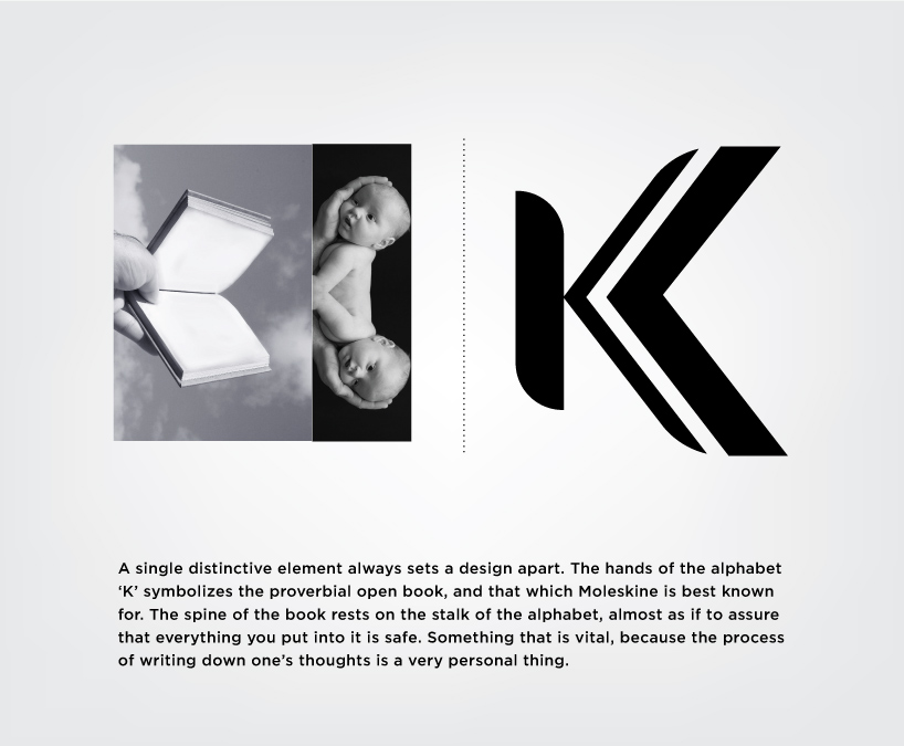
discription
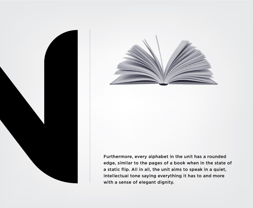
charector
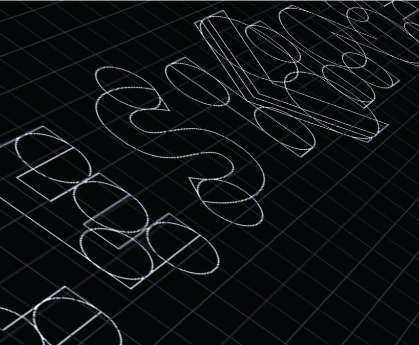
process
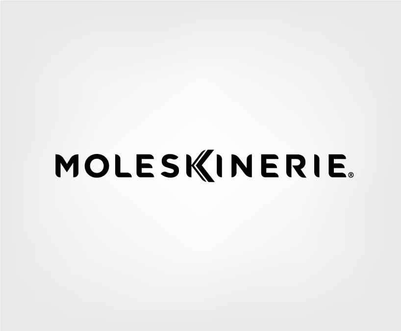
final logo
adaptation