new packaging design for maestro limpio by emanuele a. patton by emanuele andrea patton from denmark
designer's own words:
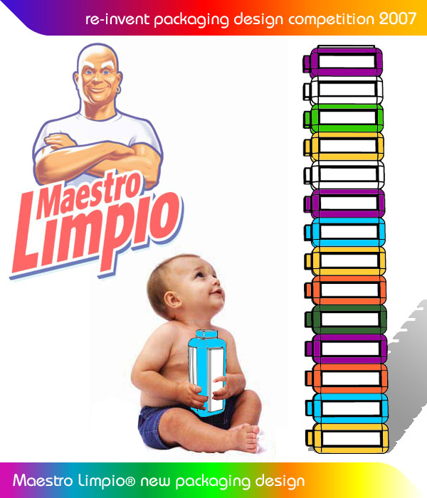
This new packaging design for Maestro Limpio has the purpose to create both a stronger and recognizable family look and make the consumer re-use the packaging for different purposes. The new product is therefore designed as a module, a brick with a strong structure that after his primary use can be adapted to many different functions.
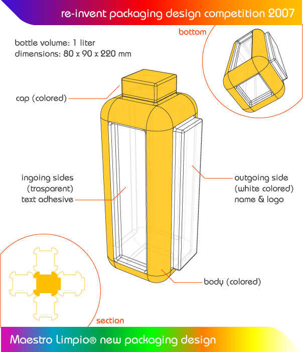
The shape is rectangular with rounded corners and the sides are either outgoing or ingoing: an aspect that makes it possible attaching one bottle to another like a puzzle.
The packaging design fits to the all Maestro Limpio product range (at the moment with 1 liter capacity).
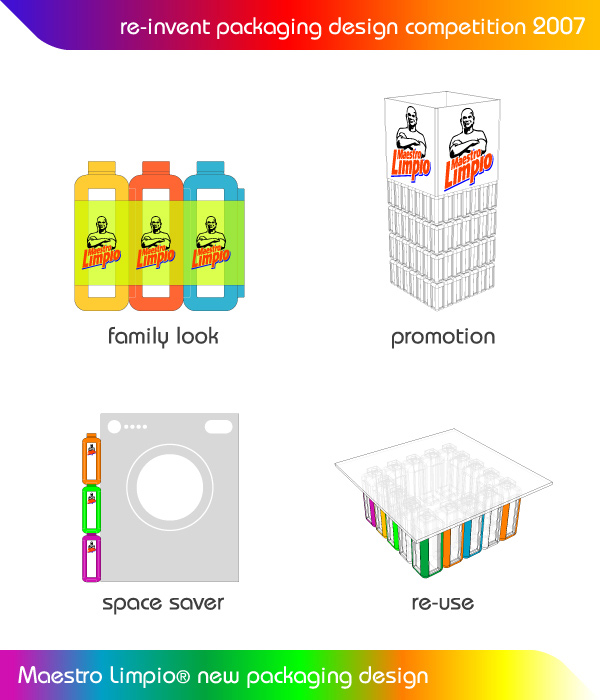
This new design offers for the producer a series of possibilities for the promotional aspect (it is possible to sell “sets” of products, simply joined together, or build self standing structures in shopping areas attracting the consumer attention …)
The square shape and its joints also make the packaging easy, the waist space minimal and shipping costs lower.
For the consumer another advantage is the minimal storage space required.
The bricks can be use to build light structure for student’s furniture, kid’s outdoor or indoors games and many other applications
The aesthetic is simple and have both colored and transparent surface.
The product should be produced HD-PE or similar.
new packaging design for maestro limpio by emanuele a. patton
 new packaging design for maestro limpio by emanuele a. patton
 new packaging design for maestro limpio by emanuele a. patton