SIMPLICITY by caroline gery-frioud from france
designer's own words:
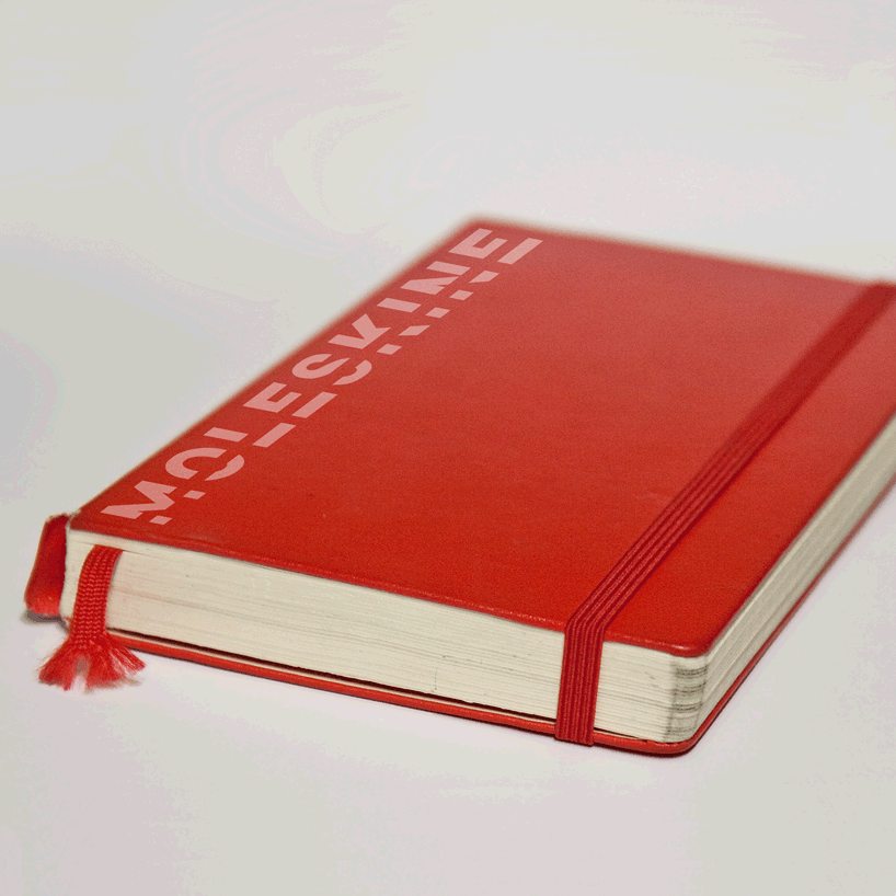
no useless additions here, no color other one than the black, a typeface symbol of modernity while remaining timeless and a line kicks down in reminder in the famous elastic of diaries moleskine. the "m" can be also used alone as logotype of the brand. its simplicity allows to use it in quite the sizes while remaining legible. and can be also applied very slightly by becoming discreet but by remaining just as much effective.


shortlisted entries (2162)