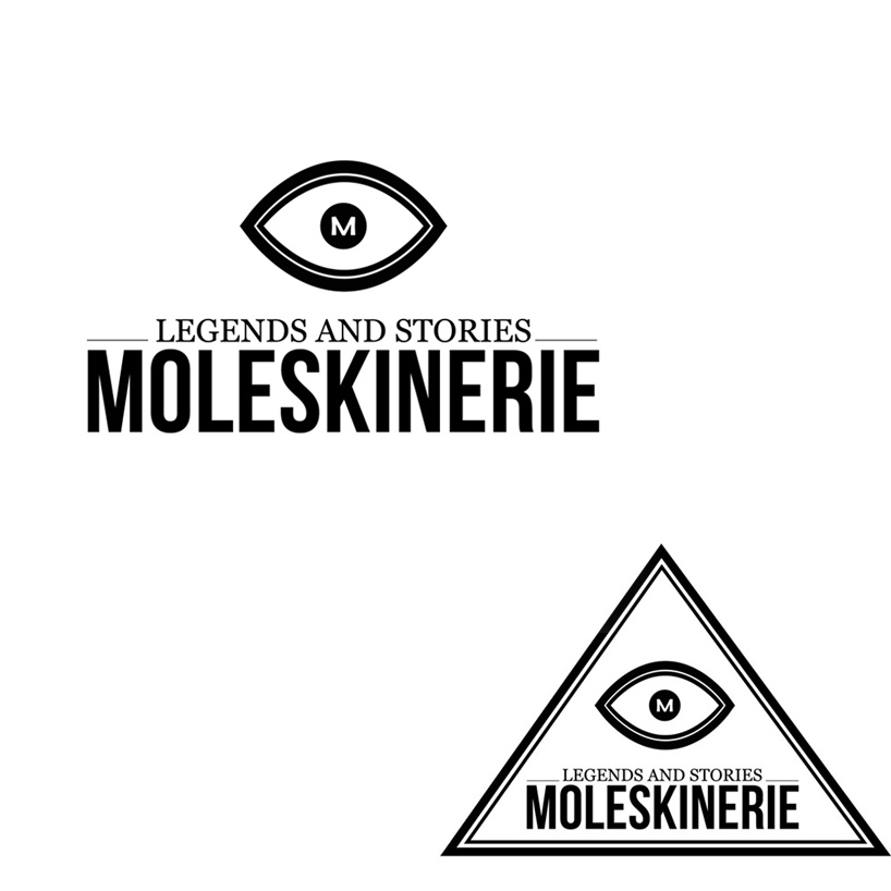
The Moleskine Eye by Ana Lisboa from portugal
designer's own words:
Before we began drawing any kind of sketch for the Moleskinerie logo we researched the Moleskine Trademark, what it venues and what impact it has on society. From the beggining we wanted to create a symbol that would give Moleskinerie it’s own identity, we wanted a symbol more than a typeface design. We thought about the amount of time that Moleskine sketchbooks accompany us, in it’s usability and in the thousand different ways each of us uses them. Each one of us who owns one has a different feeling, vision of it. They can be schedules, address books, graphic diaries, tour guides.
The Moleskine Eye – through this thought process we came to the idea of an eye. We draw a lot of them by hand keeping in mind that it would stand for the global vision of all users. It didn’t have to be modern; we wanted it to be timeless, past, present and future. We wanted to embrace in it’s sight all the work that was and will be made by thousands of people (painters, writers, designers...) that proudly use and share ideas within their Moleskines.
The font type we used for this logo was chosen with the solo purpose of being objective, clear and easy to be identified. It is sans serif to facilitate it’s reading. So we chose Bebas Neau for the title and Georgia for the subtitle (for a more classic, familiar touch and connection to Moleskine)
We initially design the logo manually and then digitized it using Illustrator to a vector. An optional form was added to the logo for some communication support systems one might use.
The Triangle – This shape automatically came to our minds after gathering the concepts we had for this logotype. Besides wanting to reinforce the time/space notion, this shape links us to communication and means to transmit messages, it refers to semiotics: a thought, a symbol and a receiver. With this element we underline the idea of the human thought and how it translates to his sketchbook. The triangle also helps making this a striking logo: within it we bond this three essential points: Moleskine, the people (consumer) and the Moleskinerie blog.
Black and white where the colours we decided on, although others can be chosen. Being clean and simple makes the use of background patterns possible. This logo respects the image of Moleskine and maintains it’s familiar, simple visual language.
logotype