Tons de couleurs by ricardo borja from canada
designer's own words:
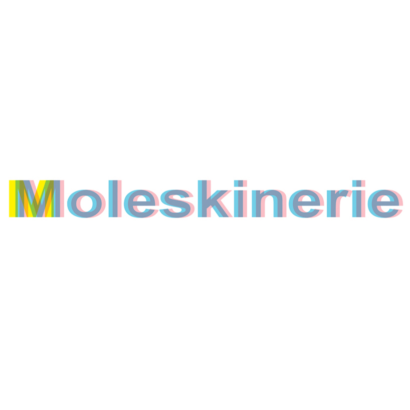
Inspired the minimalist and effectiveness of the Molskine logo and products, “tons de couleurs” proposes a versatile visual identity for its blog-outlet. The main logo is a blue and pink MOLESKINERIE bleed with a multi colored M – as a symbol that we are one and the same, despite gender, nationality or any other distinction between us.
Because blogs are “live documents” that constantly get updated, this proposal suggests that we could alter the colors depending on what Molskinerie chooses to represent on that day. Whether it be a cause, and event or a contry in honor for any particular reason (pink for breast cancer awareness, orange for dutch design week, shades of red for the fall leaves of Canada for example).
the primary logo
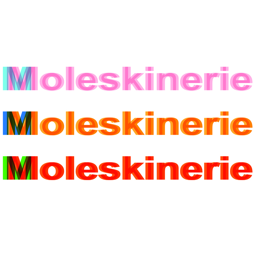 Themed logo
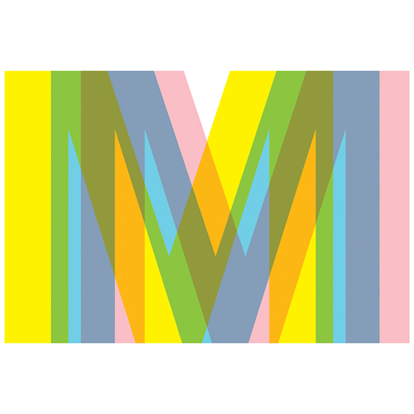 the Mblem
 if single color is needed