uppercase letters by Carla Mata from portugal
designer's own words:
to create all the proposed options to the moleskine’s logo we use the concept that is present in this brand: the simplicity, the elegance and the imagination.
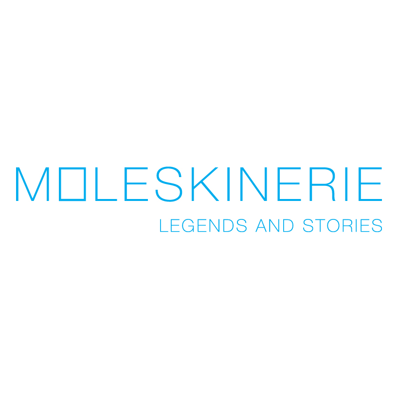
knowing that the moleskine is an international brand known for its sketchbooks and agendas and being a part of moleskinerie’s blog, which is the on line spot for moleskine lovers, this first logo intends to transmit the simplicity and the highlight that language normally presents.
with the image of moleskine’s legendary notebooks, the first and second logo represents in the letter "o" a stylish notebook, where is emphasized the reference to moleskinerie and moleskine.
in the second logo are used traces that are lying at the beginning and end of the lettering, which seek to assert its presence in the web world and translating that moleskinerie has great importance on the items that describe the course of your page.
in these first two logos, the typography used was helvetica neue 35 thin, and was chosen because it has been a reformulation of the original helvetica and also has improved its readability and was structurally unified. this allows a good relation between typography and picture.
the chosen color was cyan, because it functions as a vibrant color, promotes inspiration and is an allusion to the freshness of events and new products that continue to be promoted by this blog.
the third and fourth logo, as well as having the same concept as the previous ones, were created to reinforce the idea of having our skecthbook always ready for us and always within reach.
then the letter "m", to enter the stylized image of the famous moleskine, open as the brand always was, made available to satisfy all needs and being ready to point to new ideas that might arise for the development of their mythical product.
this is also related to moleskinerie’s blog that provide us simplicity of search and access. the interaction created by allowing comments on each post of moleskineries’s blog provides tools for brand awareness.
the color used in the third logo was dark red, because it can convey elegance, sophistication and leadership. and also because is linked to emotion / passion, this blog is targeted to people who no longer live without their moleskine.
the fourth logo, has a brown color because is linked to maturity, meaning the long existence of moleskine sketchbooks.
finally, the fifth logo comes in a simpler way, with only a composition of several moleskine seen in profile, making connection to the aesthetic appearance of the famous brand of notebooks.
it uses black, because it’s connected to luxury and to be linked to the covers of books.
in the third, fourth and fifth options the typography used were flama, being a type of font used in various news publications, its forms are simple, direct and easy to read.
all options presented here are in uppercase letters as an affirmation and as a greeting card in the web and in the world of moleskine.
First logo – Book
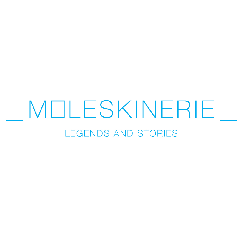 Second logo – Traces
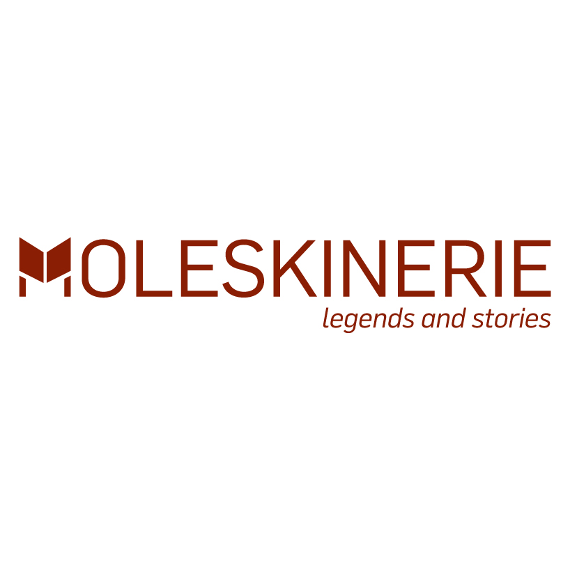 Third logo – notices
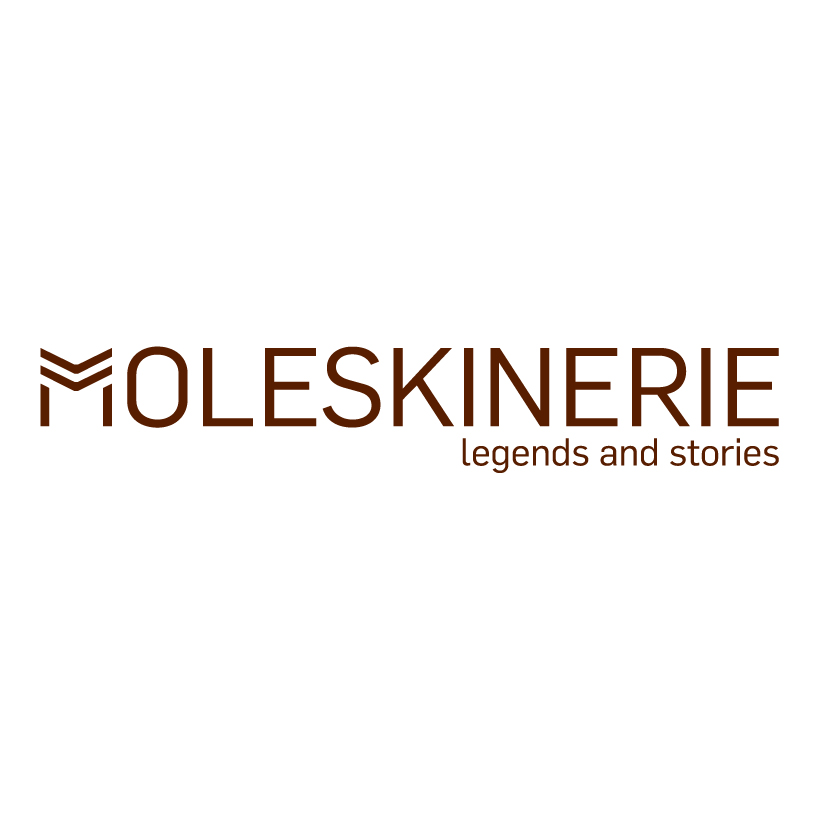 Fourth logo – Open
 Fifth logo – Profile