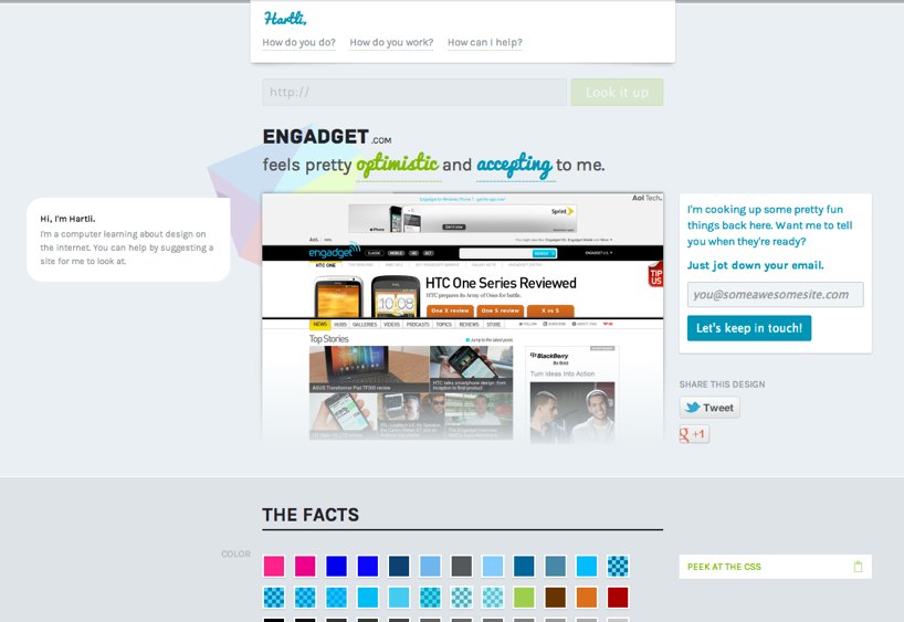
an overview of hartli’s facts page (engadget.com is shown here for reference)
every design problem starts with some basic questions. who is the audience? what’s the site for? what’s the right interaction? what’s the communication style? all good questions, but rarely grounded in implementation. there’s still a big gap between “just make it awesome” and actually making it, awesomely. there are a ton of “good web design” lists out there, but inevitably at some point you hit a wall; how can you actually pull inspiration from such a massive collection of color, typography, layout, grid, etc. and do something useful with it.
there’s so much data and complexity; too much for any one person to comprehend, but it’s the perfect job for a computer. so we quickly setup a server and created a program with an eye to visually analyze sites and report back. his name is hartli, and his job is to help us make the internet more beautiful.
hartli is a computer learning about design on the web.
unlike simple site-scraping schemes that grab static html/css assets and try to infer visual style, hartli actually runs each site on a virtual browser and interacts with the page.
hartli is a design enthusiast, trying his very best to understand colors, typography, layout, grids, repetition, alignment, symmetry, contrast and just about anything else he can get his hands on. via a simple web interface, hartli shares everything he knows about the internet for you to explore. in fact, the more sites hartli looks at the better he gets.
in the short time we’ve had him up and running, we’ve already noticed some pretty big gaps in our otherwise broad view of design on the web. poke around and you’re sure to find all kinds of patterns you had no idea existed (like color palettes in different countries, the usage ratio of fonts, and all kinds of clever page layouts/architectures). go on, type in your favorite sites (like flickr, engadget, or theverge) at http://hartli.com see what he thinks!
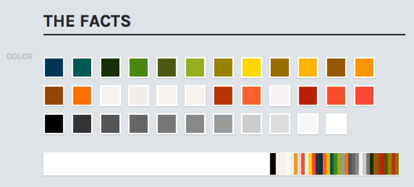 hartli’s color palette generated virtually by analyzing a web site
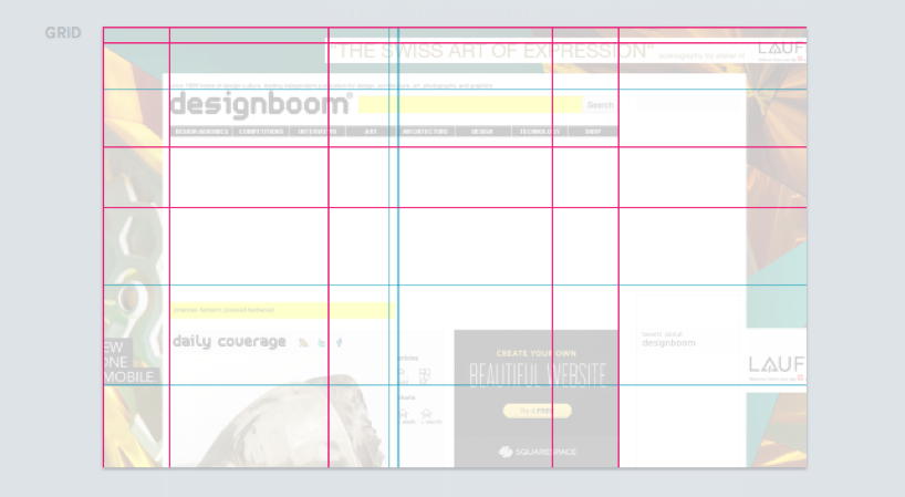 generated grid analysis helps to find patterns in the page layout
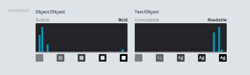 contrast map showing the frequency of various colors that are adjacent to one another
 all fonts used on the page, broken down by percentage
 repetition graph showing occurrences of various sizes and aspect ratios used on the page
designboom has received this project from our ‘DIY submissions’ feature, where we welcome our readers to submit their own work for publication. see more project submissions from our readers here
PRODUCT LIBRARY
 Jul 23, 2024
 Jul 22, 2024
 Jul 15, 2024