 Sep 13, 2023
TYPOGRAPHY DESIGN(133 articles)
typography design comprises projects relating to the use of fonts or letterforms.
Sep 13, 2023 Feb 23, 2023
 Jan 24, 2023
 Jan 19, 2023
 Dec 09, 2022
 Dec 01, 2022
 Aug 17, 2022
 Jun 22, 2022
 Dec 02, 2021
 Nov 02, 2021
 Aug 04, 2021
 Jun 01, 2021
 Apr 14, 2021
 Nov 26, 2020
 May 22, 2020
 Apr 25, 2020
 Mar 11, 2020
 Dec 11, 2019
 Dec 04, 2019
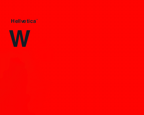 Oct 29, 2019
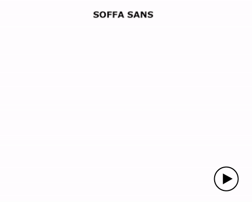 Jul 01, 2019
 May 01, 2019
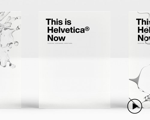 Apr 14, 2019
 Mar 05, 2019
 Aug 09, 2018
 Jun 11, 2018
 Jun 04, 2018
KEEP UP WITH OUR DAILY AND WEEKLY NEWSLETTERS
X
5