under the theme ‘mobile phones for 2011’ roughly 2,000 submissions were received throughout june and july, from which a total of 24 winning entries have been selected: one grand prize, two runner-up prizes (one per category), six judge’s special awards (one per judge), and 15 honorable mentions. the panel of judges included product designer mr. toshiyuki kita, art director mr. manabu mizuno, nikkei design magazine’s chief editor mr. kazuya shimokawa, and the japan design association’s chairman, art director mr. katsumi asaba. the fujitsu mobile phone design award 2009 was organized in collaboration with the NPO japan design association. the nine winning designs – grand prize, runner-up prizes, and judge’s special awards – were on display at 100% design tokyo.
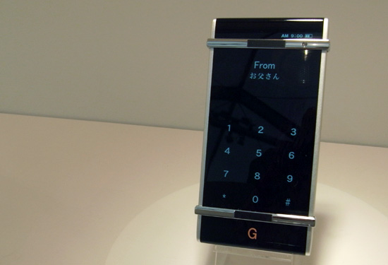
‘gesture’ by jin-gwon go with advances in graphic user interfaces, functions become icons for easy use. the design features an interface that can be operated according to the user’s hand gestures when operating the mobile.
‘gesture’ by jin-gwon go prototype image © designboom
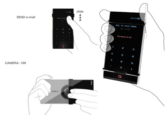 ‘gesture’ by jin-gwon go(‘gesture’ by jin-gwon go won the grand prize)
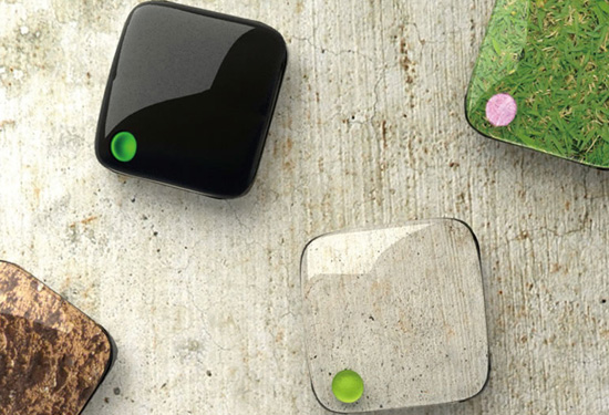
‘soap’ by YAN a mobile phone designed for children to promote the idea that well-being is tied to cleanliness.
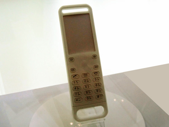 ‘soap’ by YAN prototype image © designboom
(‘soap’ by YAN won the runner-up prize in the practical category)
‘fold-a-phone’ by hanna sahlen / sachiko munakata a paper-thin handset that can be folded into a compact shape and unfolded for use as a phone.
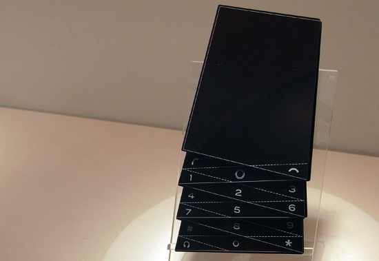 ‘fold-a-phone’ by hanna sahlen / sachiko munakata prototype image © designboom
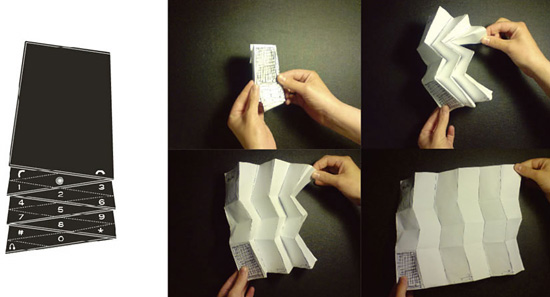 this project uses muiro-ori folding(‘fold-a-phone’ by hanna sahlen / sachiko munakata won the runner-up prize of the dream category)
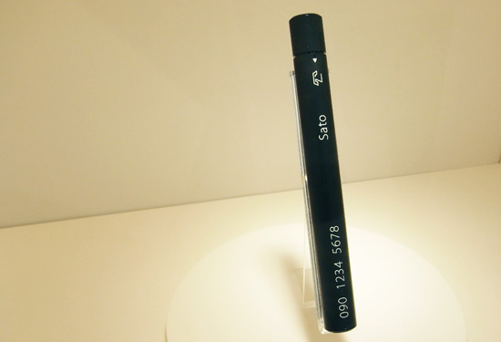
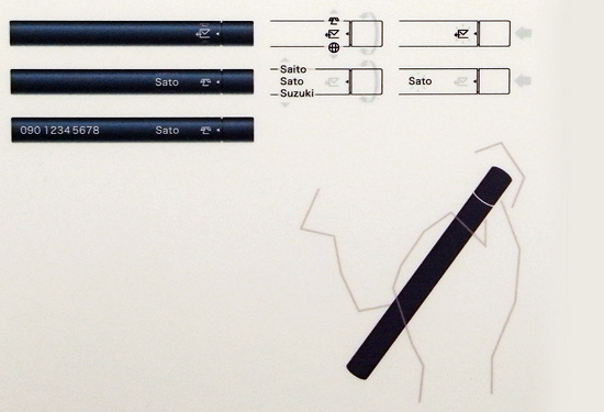
‘adjustick’ by izumi tanaka a stick-like design that displays the minimal information through simple manipulation. it also projects a usable screen and keyboard
 ‘adjustick’ by izumi tanaka prototype image © designboom
 ‘adjustick’ by izumi tanaka image © designboom
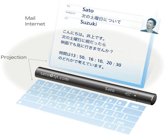 ‘adjustick’ by izumi tanaka(‘adjustick’ by izumi tanaka won the judge’s special award by toshiyuki kita)
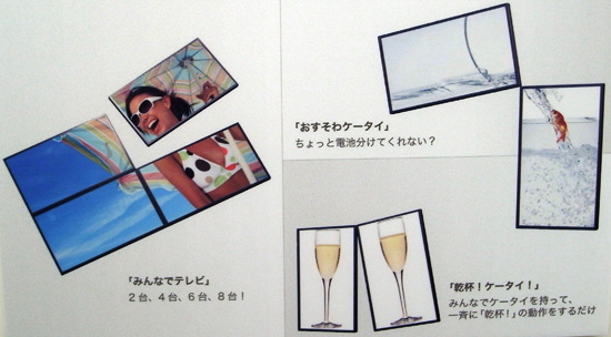
‘osusowa keitai / sliced-up phon’ by kan yasuma, yo ishigaki, yoshihisa tanaka multiple mobile phones that can be connected and used as one. this enables one phone to share its battery’s charge with another, or for several to be joined together to form one large screen.
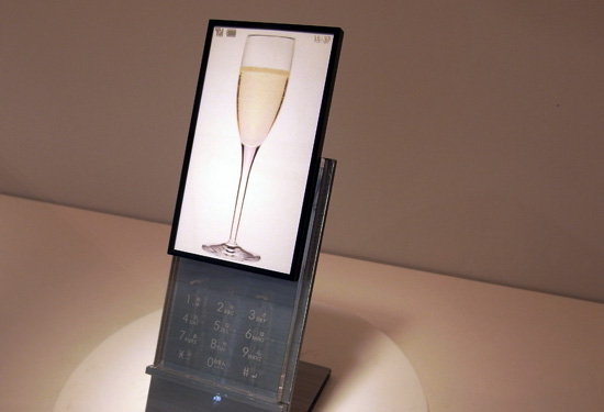 ‘osusowa keitai / sliced-up phon’ by kan yasuma, yo ishigaki, yoshihisa tanaka prototype image © designboom
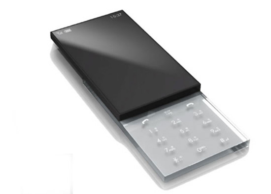 ‘osusowa keitai / sliced-up phon’ by kan yasuma, yo ishigaki, yoshihisa tanaka
 ‘osusowa keitai / sliced-up phon’ by kan yasuma, yo ishigaki, yoshihisa tanaka(‘osusowa keitai / sliced-up phon’ by kan yasuma, yo ishigaki, yoshihisa tanaka won the judge’s special award by manabu mizuno, art director)
‘chamelephone’ by hiroyuki tabuchi the mobile phone’s body can mimic and take on the texture of the surface that it is placed on.
 ‘chamelephone’ by hiroyuki tabuchi prototype image © designboom
 ‘chamelephone’ by hiroyuki tabuchi(‘chamelephone’ by hiroyuki tabuchi won the special award by kazuya shimokawa, chief editor of nikkei design magazine)
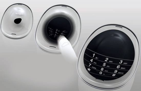
‘ F-circle’ by yuji ito the design’s distinctive and timeless appearance is a departure from the typical rectangular mobile shape.
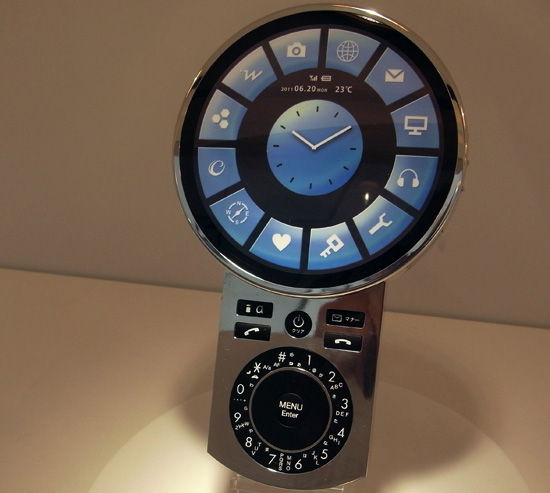 ‘F-circle’ by yuji ito prototype image © designboom
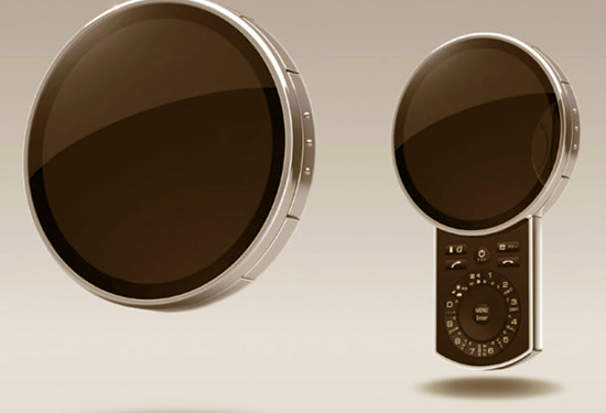 ‘ F-circle’ by yuji ito
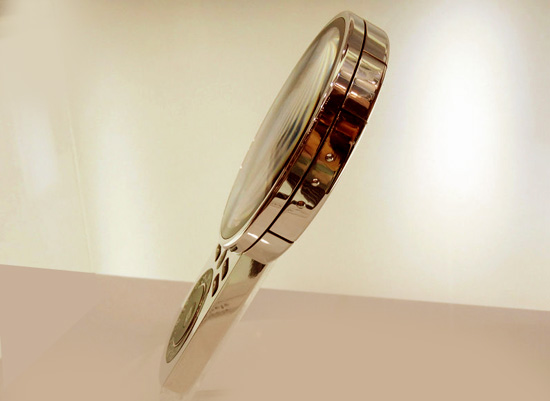 ‘F-circle’ by yuji ito prototype image © designboom
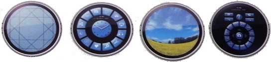 ‘F-circle’ by yuji ito
(‘F-circle’ by yuji ito won the judge’s special award by katsumi asaba, chairman of japan design association)
‘kaora’ by wataru igarashi ‘screens have to be flat’ – the goal of this design was to break convention and create a distinctive design allowing user-friendliness previously unheard of.
 ‘kaora’ by wataru igarashi prototype image © designboom
 ‘kaora’ by wataru igarashi
(‘kaora’ by wataru igarashi won thejudge’s special award by hideyuki saso, corporate senior vice president, fujitsu limited)
‘amoeba phone’ by kwak yeon the entire surface of the mobile phone is a touchscreen, increasing usability, while its interior concave shape is designed to fit the user’s face when they are talking on the phone.
 ‘amoeba phone’ by kwak yeon prototype image © designboom
 ‘amoeba phone’ by kwak yeon
(‘amoeba phone’ by kwak yeon won the judge’s special award by kimitaka kato, president of fujitsu design limited)
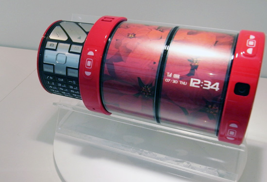
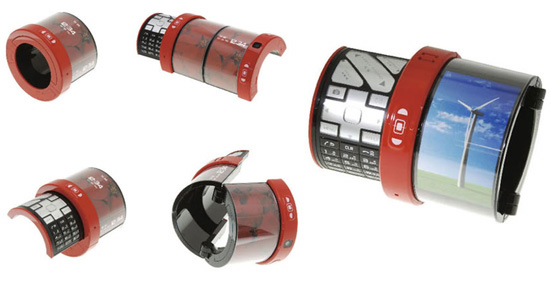
another new fujitsu design was on display, whose screen and keyboard pulls apart to be used separately. it uses magnets to connect the two pieces in the desired configuration.
a similar concept went into production : fujitsu separate keitai F-04B
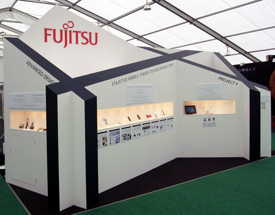
tokyo design week 09 (30)
 Nov 24, 2009
 Nov 12, 2009
 Nov 12, 2009
 Nov 12, 2009
 Nov 12, 2009
PRODUCT LIBRARY
 Jul 22, 2024
 Apr 22, 2024
 Mar 21, 2024
 Mar 13, 2024