talk to OPPO ColorOS design team: a lesson in simplicity
design blurs the boundaries between technology and art at OPPO. launched in october 2021, ColorOS 12 is the new operating system for the smartphones of the china-based consumer electronics brand. the OPPO design team has refined and polished each detail of its user interface to deliver an intuitive user experience. this is in the mission of enriching our daily lives, aiding well-being and, of course, improving social communication. from concise language to an entourage of accessibility features, every single element of the operating system has been thought-through so that users, just as designboom tested out personally, do not have to.
as well as trialling OPPO ColorOS 12, designboom spoke with chris chen, product design director of OPPO ColorOS, and nora joy wilson, design project manager of OPPO ColorOS.
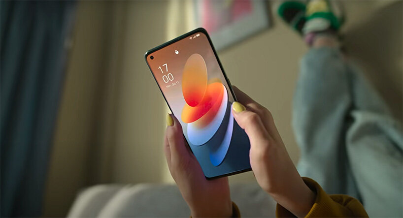
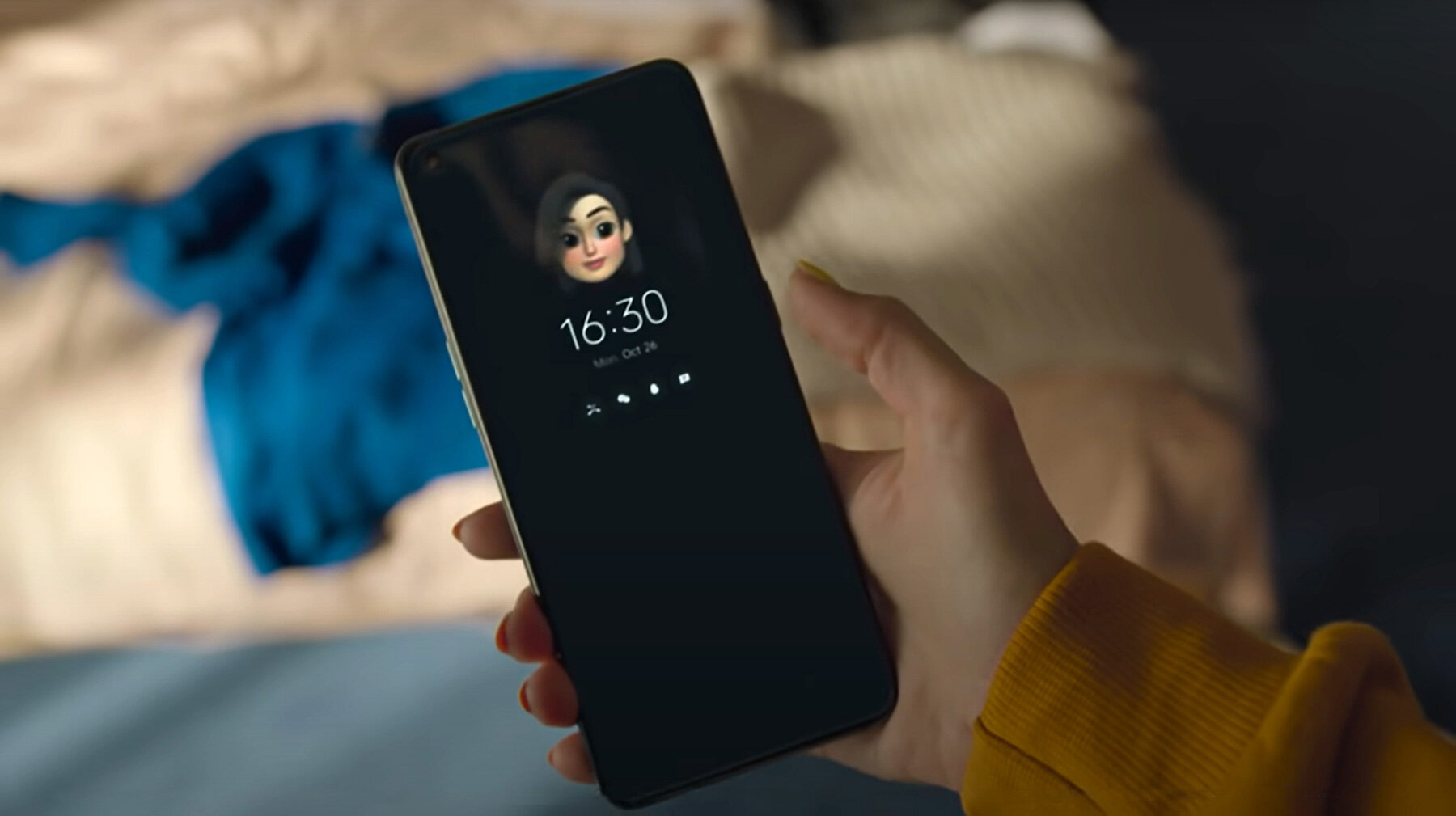
ColorOS 12 homepage: creation tool enables wallpaper, ringtones, icons and more to be customized by users
all images courtesy of OPPO
OPPO coloros designed for the user
‘we put the users first in everything we do; beauty follows functionality in our design. our approach is like marrying the technology to the human rather than vice versa. we look for ways that the design can match the user’s existing habits rather than forcing the user to create a new habit to suit our design aesthetics,’ explains nora joy wilson, design project manager of OPPO ColorOS, to designboom.
the popularity of OPPO is of no surprise then. operating in more than 140 countries and regions, the smart device brand has gained a following of over 460 million users since launching its first mobile phone – smiley face – in 2008. ever since, the company has been on a relentless pursuit for the perfect synergy of aesthetic satisfaction and innovative technology. this mission goes beyond the beauty of the physical object to the richly-enabling of the ColorOS operating system.
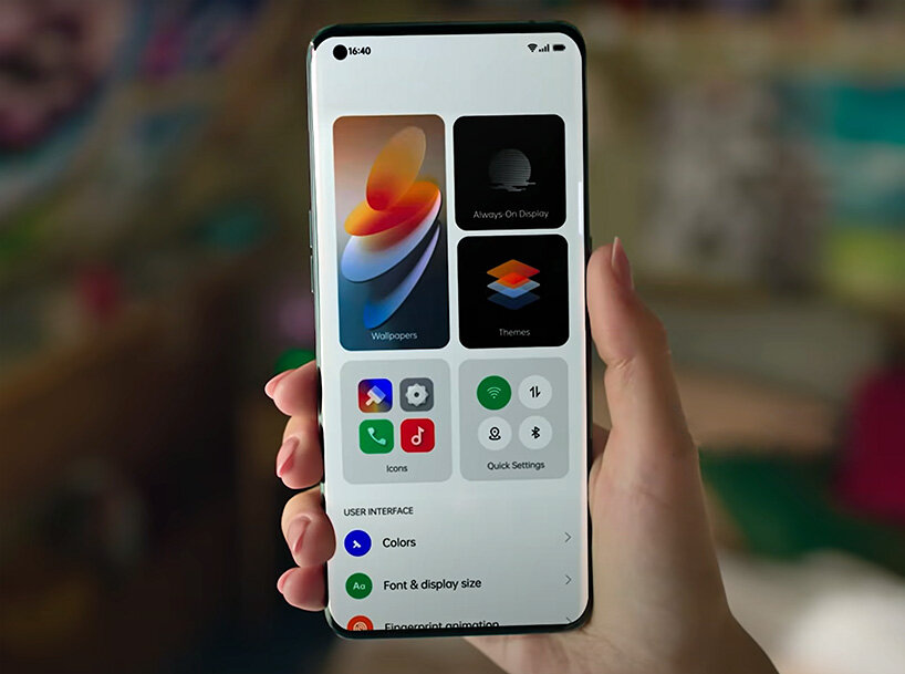
inclusive design language: a less-is-more approach refines a refined, highly intuitive user interface design
ColorOS is a highly customized, intelligent and richly-designed android-based mobile operating system. by improving user efficiency, ColorOS firstly aims to facilitate the easy completion of tasks. secondly, it must be convenient, designed to be both simple and subtle, to serve the core needs of target users. lastly, the design needs to offer a unified yet individual experience for its global following.
‘ColorOS has more than 460 million users worldwide, which is a very, very large number. the demographic is so wide reaching, how can we cover this many people? it is a very big challenge but one that our designers are always thinking about. we need to understand and design for users in groups,’ questions chris chen, product design director of OPPO ColorOS, in the interview with designboom.
the inclusive design of ColorOS 12
the core design concept of coloros – infinite
to begin, the foundation of ColorOS starts with the ever-evolving infinite design concept, which lays both the aesthetic and functional design of the system. from iteration 1.0 through the latest 4.0, the design concept encompasses the introduction of infinite screen – a concise design to work full-screen on smartphones – a lighter and more efficient design language, personalization abilities through ‘creation’, and now the focus on inclusivity.
‘the concept of infinite design firstly follows the mantra that less is more. in chinese painting and calligraphy, leaving blank space is a technique that pays attention to composition so that, when structure is added, the artwork changes to show greater contrast between shades. this influenced our design interface. we want less content to ensure our design only shows the key, most important things,’ explains chris. ‘secondly, the concept focuses on the user’s feelings. we believe scientific and technological progress must ultimately serve people. we pay attention to the real user experience on issues such as users’ feelings while using the phone. without being overly customized as to lose its core essence, the design should feel personal to as many users as possible.’
the result is modern, geometric and elegant: the framework establishes regularity, frosted glass texture adds dimension, and light and shadow play creates depth. it is rich in content yet clean in appearance to give space to highlight key functions when the user needs. with the addition of more personalization options and inclusive features, the design amazes in its simplicity as it converts the belief that product iterations should be more complex. ColorOS 12 is the sharpest-ever interface design to date.
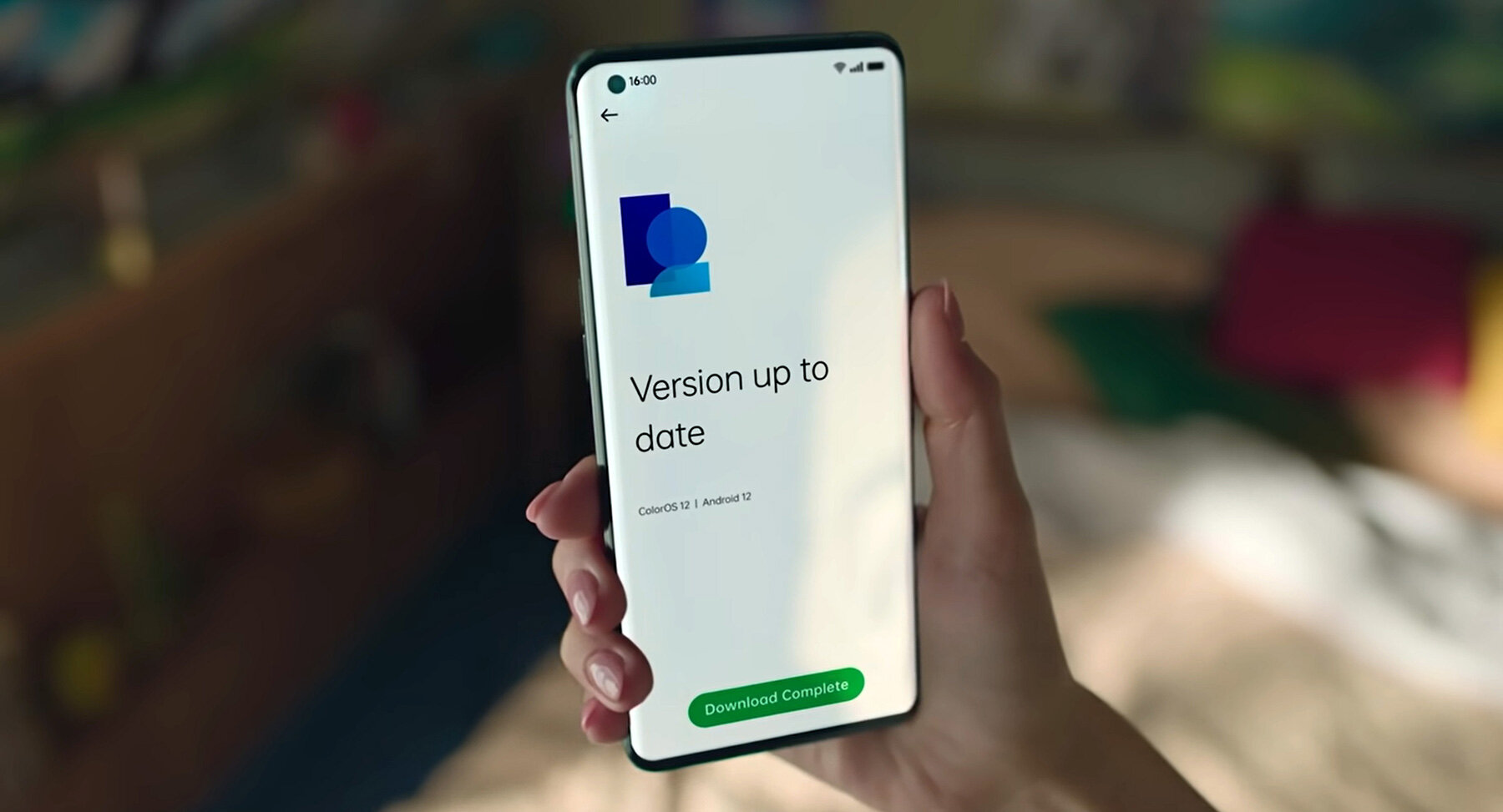
OPPO ColorOS 12 was launched in october 2021
the interation of infinite design concept in colorOS 12
1) inclusive design language
‘most people, from all demographics and geographical location, use phones in a surprisingly, strikingly similar way. it doesn’t matter where someone comes from; a design will resonate well if it is beautiful and functions properly,’ states nora. ‘in terms of the core OS, the design language is universal but optimizations have been made for languages. the chinese language is very short and concise but english is long and portuguese is even longer. the design needs to accommodate for this whilst still being as effective. information density is reduced so text is easier to read.’
ColorOS 12 introduces the inclusive design language, which is an all-new framework used to present information in a way that emphasizes simplicity as well as individuality in the user interface. this is how the system caters to an extremely diverse group of people, each with their own needs, customs and habits. it adapts to work, look and feel as intuitively across all 67 languages. a multilingual language team works with the OPPO designers to ensure this. the experts also aid the development of a unified vocabulary so that icons and metaphors translate in all localized contexts.
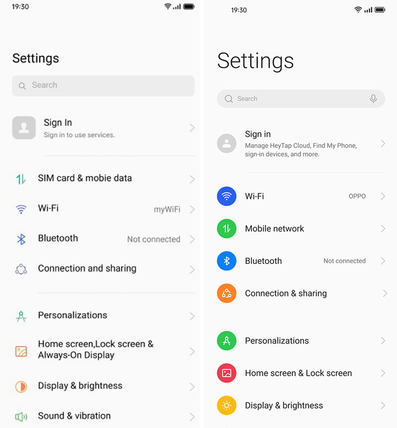
ColorOS 11 and ColorOS 12 comparison
2) accessibility
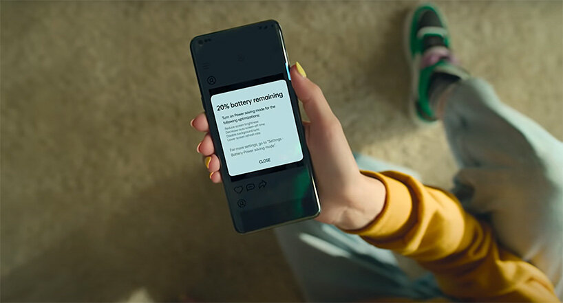
color, vision and sound are all factored into the inclusive design of ColorOS 12. for the first time, the system integrates 22 accessibility features from google’s android plus two self-design features: color vision enhancement and high contrast colors. this is all in the name of providing clear information, even just at a glance. OPPO hopes to cater to diverse users’ needs, especially for groups of people that may have special requirements to better use their phones.
‘we have integrated 22 of google’s accessibility features alongside our own. we don’t add extra features just to differentiate ourselves, rather we look for ways to add value, especially to underserved groups with specific needs. we focus a lot on fulfilling needs that aren’t being met yet,’ notes nora. ‘the color vision enhancement corrects hues for people, who, perhaps, have a different sense of color and lost certain vibrancies. a vision test enables the screen to be optimized for their color palette so that the display works as effectively. the high contrast text feature switches any text to black and white so that it is very easy to read. we want everybody to be able to use the design comfortably.’
users can create a customized, life-like Omoji to fit different styles, accessories and more
3) user creation
the design delves deeper than the traditional understanding of accessibility to make all features on the smartphone easier. it is all in the aim of improving the user’s daily life. one such inclusion – and a very popular one at that – is the creation tool. users play designer by adjusting aesthetics to fit a personal style. customization ranges from wallpaper to the always-on display, icons, ringtones and more. the latest iteration introduces a 3D animated Omoji using a face-capture algorithm with 77 pinpoints and over 200 stylistic elements to render a personal avatar.
‘creation has always been super important for ColorOS. users can change the shape and colors of the icons, wallpaper customizations, and the future versions of ColorOS can be developed based on users’ feedback on these customization features. for ColorOS 12 specifically, we have the Omoji feature that involves 200 or more stylish, trendy accessories and expressions that can be combined. users can create literally millions of different compositions to make a very unique customized Omoji that can be used for video chats, profile photos and more,’ explains nora.
the design enhances the use of the ‘always-on’ display which shows key information at a glance and even the user’s ‘Omoji’
OPPO enriches well-being
‘the OPPO experience is more human. it is warm and meaningful,’ confirms chris. ‘people’s feelings have changed a lot during the pandemic: there are more psychological pressures and changes of behaviors, like staying indoors, not traveling and, especially, the use of phones. as people look to be entertained by the digital world, we wanted our design to offer a perspective of art and to evoke good feelings.’
from its customizable framework to the introduction of inclusive design language, OPPO ColorOS 12 is more refined, capable and enriching than ever – and this is all to maximize users’ joy. however, as people’s lives migrate further into the digital world for entertainment, communication and work, the brand also recognizes and supports the ever-changing needs of the consumers. the latest evolution of the operating system focuses on digital health. the UI evokes a personal, humanized experience whilst well-being features go a step further and turn therapeutic. for example, OPPO ColorOS feature, O Relax, creates a tranquil hybrid space of physical and virtual, where users become ‘grounded’ in the senses of their environment.
value the sounds of the city with OPPO Relax
‘at OPPO, we have focused a lot on digital health over the past few years. for example, O Relax is an application born from the increase of a fast-paced life. the overall concept explored the paradox of development in science and technology; science and technology might improve the efficiency of life but it does not necessarily improve the quality of life. our design aims to make people slow down and relax,’ clarifies chris chen, product design director of OPPO ColorOS.
‘we noticed how people often isolate themselves by putting on headphones and creating their own bubble. we wanted to create a space that embraces the environment around these users,’ adds nora joy wilson, project design manager of ColorOS. ‘we collected sound samples from a bunch of cities from around the world so that users can transport themselves to these places depending on their mood: a lively or relaxing background, or even one that triggers certain memories. we hope O Relax will also promote users to start listening to their own, present environment in a different way.’
what better way to show how, with ColorOS 12, OPPO is more than a phone manufacturer; they are an enricher of lives. the design team creates smart devices that transcend beyond communication to aid ever aspect of user behaviors.
every element of OPPO ColorOS 12 has been designed to aid user behavior
interview info:
brand: OPPO
interviewees: chris chen, product design director of OPPO ColorOS; and nora joy wilson, design project manager of OPPO ColorOS
product: ColorOS 12
dbinstagram (2250)
 May 22, 2024
 Nov 10, 2023
 Dec 20, 2022
 Dec 13, 2022
 Oct 26, 2022
OPPO (15)
 Oct 31, 2022
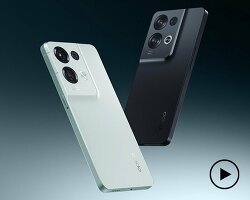 Sep 23, 2022
 Sep 21, 2022
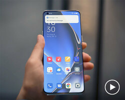 Aug 30, 2022
 Mar 09, 2022
smartphone design (231)
 Jul 19, 2024
 Jul 13, 2024
 Jul 11, 2024
 Jun 02, 2024
 May 24, 2024
PRODUCT LIBRARY
 Jul 22, 2024
 Apr 22, 2024
 Mar 21, 2024
 Mar 13, 2024