sonodesign: the clock I can't see

color blind? 'the clock I can't see' is a new product from sonodesign.
upon first glance, the congested dot patterning on the face of the time-teller makes it difficult to
recognize as a clock. take a closer look and you will see numbers hidden in amongst the spots.
this clock is made of double thickness high quality acrylic and will hang on a standard picture hook.
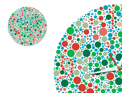
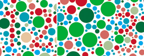

the number '12'(left) and the number '3'(right)
What will be the next desing? A huge wall clock with braille numbers?
Or a 150 cm high clock that can be read from above for dwarfs?
Q. does every design have to solve a problem
A. isn't the function of a clock to tell the time? if you don't have a clock or a time piece then you may not be able to tell the time, therefore a clock / timepiece is an answer / response to this particular problem.
Q. I love this design and why is it any harder to read than clocks that have no numbers at all.
A.I'm surprised that this question has even been asked, it's not rocket science. It's harder to read because it is a chaotic mess of pattern and it is hard to distinguish the hands against the background.
modernest are you colour blind? you sound quite bitter. I like it
i don't think it's offensive to colourblind people..
especially since my fiance is one of them..
he thought of it as a very cool piece..
isn't design all about thinking out of the box???
it's like those that don't even have numbers..
people who can read a clock or watch know where the numbers go..
=)
There are so many other products that fail at being functional, this will sell. Remember, we have to earn a living, the market will judge its success.
Personally I would have reported on their smaller profile shades:
http://www.sonodesign.co.uk/Collection/Products/profileshade_mini_std.aspx
A welcomed addition to the range.
It is like one of those tests...
color clock - flop clock - cannlamp by sonod
the steel disc has been bent giving the appearance that the timepiece is peeling away from the wall
studio ve: manifold clock - telling time in 3
a time-teller's form is based on a mathematical function - the study of riemann surfaces.
vadim kibardin: white + white
the timepiece interacts with its environment as the hour display may dim or brighten according to the presence or absence of external light.
ziiiro: proton + ion
both series of minimalistic timepieces feature unique time displays in addition to interchangeable transparent bracelet straps.
ugo architecture + design: 100 tree
due to the architects' aim to have every room of this summer house boast a lake view, the building has been formed in a U-shape...
10 design: dalian library
the library is intended to be a transformative environment that pulls visitors into a unique landscape.
RENAULT 4 ever behind-the-scenes
'horsey' by eungi kim
SELFPROMO - january 17 - march 17
POP UP - january 17 - march 17
keep up to date with recent articles and upcoming events.
to receive both newsletters please check 2 boxes.
no contents, including text, photographs, videos, etc. may be reproduced in whole or in part without the written consent of designboom. in addition,
no material or contents may be reproduced on the world wide web by techniques of mirroring, framing, posting, etc. without the written consent of designboom.

submit a project
publish a project
email
RSS
facebook
twitter


