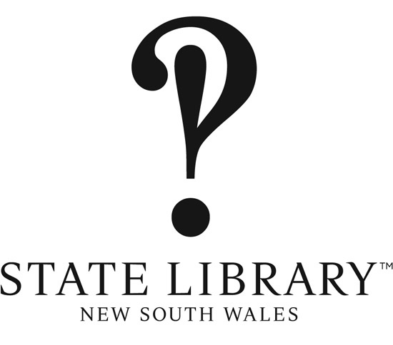
logo design derived from the interrobang symbol
frost* design, in collaboration with the australia’s historic institution ‘the state library of new south wales’, has undertaken a major brand repositioning project aimed at attracting future generations of visitors. seeking a way to become more relevant in the ‘internet age’ and attempting to find its voice in the global platform, the frost* team devised a comprehensive program to uncover a singled minded strategic approach to be integrated into every touch point of their rebranding solution.
 style guide showcasing the application of new identity
‘as we delved deep within the DNA of the state library and its incredible collection of assets, we were continually and animatedly surprised by the rich, unique resources that were just waiting to be unearthed. we came to realize that a visit to the state library of NSW is most gratifying at that eureka moment of discovery, the happy surprise of finding something which engages you and this is the single idea that runs consistently through our approach. key to the strategy was creating a more emotive brand to excite audiences and encourage deeper relationship with a broader audience.‘- VF
this idea of ‘surprising’ appears in the execution of a new identity, which utilizes the distinctive interrobang, a typographic punctuation created in 1962 symbolizing both a question and an answer. the wordmark is based on a modified, unique serif, designed to resemble the hand engraved type on the library’s mitchell wing facade.


 logo application


 redesigned SLNSW website
however, the frost* team was careful that the identity strategy did not contemporize the SLNSW brand at the expense of its heritage and intellectual weight. the typeface design reflects its positioning as a long standing cultural institution, whilst conveying a sense of modernity relevant to today’s society.
this strategy is also reflected in the redesign of the website home page, which retains an understated simplicity, but utilizes a clean contemporary sensibility with punctuations of vibrant color.
 ‘one hundred’ alphabet’
the team also sought to bring to life the idea of ‘surprising’ in the creation of an intricate alphabet commissioned as part of of the SLNSW’s mitchell library centenary celebrations. the bespoke typeface design celebrates the release of the 120 unique objects from the mitchell library’s collection – many previously unseen by the public – that will be released from the library vault. see more of this typographic design here.
vince frost (9)
 Sep 21, 2013
 Jul 30, 2013
 Dec 16, 2009
 Nov 04, 2009
 Mar 31, 2009
 May 22, 2025
 Apr 16, 2025
 Apr 14, 2025
 Apr 08, 2025