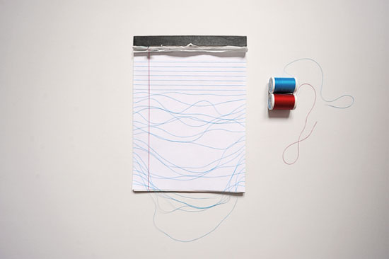
‘rules’ all images © brock davis I saw this old notepad in a drawer and had this idea. made using the notepad, a blank sheet of copy paper, two spools of thread, tape and an exacto knife.
american graphic designer brock davis is group creative director for advertising agency carmichael lynch in minneapolis. although many of his work is produced for clients, he still manages to work on projects that are self initiated. humor is integral in all his projects.
brock davis: http://itistheworldthatmadeyousmall.com — designboom asked brock davis a few questions and to comment on his work. what is your daily routine? wake up. drink coffee. play with my son and daughter. drive to work. (ride my bike in the summer) think in traffic. make things for clients. try to avoid meetings. go home. play with my son and daughter. listen to music. stay up late making things for myself. go to bed.
how did you get involved with advertising? by accident really. my cousin lived with my family while attending an ad school in atlanta. I thought the work he was doing looked fun. so I enrolled as well. he eventually dropped out and joined the marines. I graduated after 2 years and got a job at a small ad agency in minneapolis. my thought was that if I worked in a small ad shop, I would actually get to work on real assignments as a junior art director. this ended up being the case, thankfully.
please comment with a few thoughts on the following terms (in the field of design) ‘professionalism’ well, here are some of my methods. most of my ideas start as finger drawings in the air. I’ve been drawing in the air since I was a kid and it really helps me visualize. other times I’ll just get a quick vision. like last week, when I looked at the sprinkler in my garage and I imagined it painted white with red yarn shooting out of its eyelets. I’ll then sketch it down on paper or in my notebook. I love the computer but I try to work as organically as possible. I think getting the hands dirty and doing things the old fashioned way can make a designer more effective in the digital world. like many designers, I work in two primary disciplines, idea and execution. I’ve noticed over the years that most of my ideas tend to fall into one of two categories, funny or clever. sometimes both. but whatever the idea, I meticulously execute to get it to resonate as clearly as possible. I can a bit of a perfectionist when it comes to execution. which can be good and bad. ‘transgression’ I respect the brilliant work of the past and I have learned from it and continue to be inspired by it. but I’m not interested in making what has already been made. that’s no fun. I would rather make something new and hopefully inspire others to do the same. how else can progression occur?
‘professional life / private life’ I suppose the creative work in my private life allows me to enjoy the creative work in my professional life. I learned a few years ago to always give myself outlets of complete creative freedom in order to survive in an environment where creative is essentially a business and therefore rife with limitations. do you have any advice for the young? never stop being a student. absorb and learn as much as you can. easy errors to avoid? when in doubt, simple is always best.
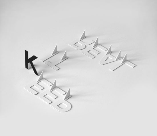 ‘K.I.R’ another experiment in three dimensional type. I made these letters using a mechanical board, exacto knife and super glue. I took hundreds of photographs, eventually choosing this image.
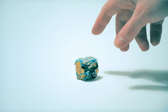 ‘crushed / scrapped matchbox car’ I found one of my old matchbox cars recently and I wondered if old toy cars could ever meet a fate similar to that of real cars. so I used a sledge hammer and some clay to crush, cube and scrap this car.
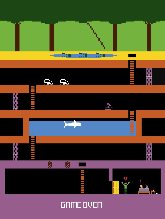 ‘game over’ I always wondered what video games would be like with unhappy endings. using the actual graphics and look of the classic game pit fall, I made this poster depicting a more original ending to the game.
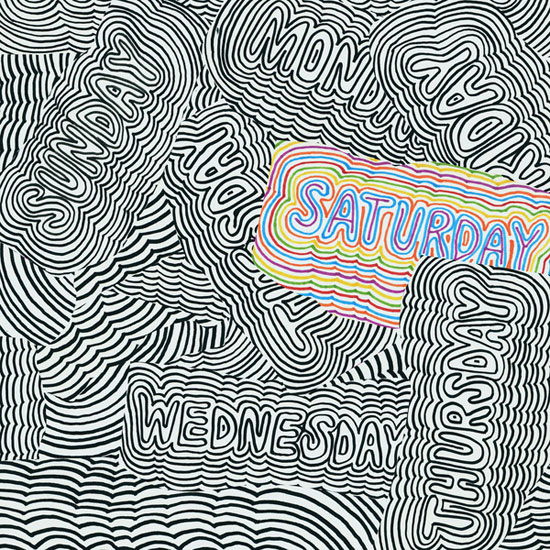 ‘saturday’ – my favorite day of the week
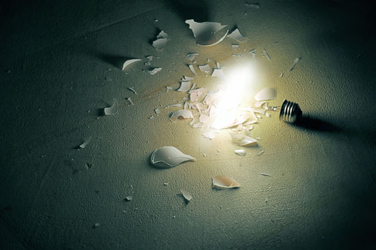 ‘bulb’ I was interested in the idea of a light bulb that continues to burn after it has been destroyed. this was created from two photographs. I went through about 12 light bulbs to capture the light, sans-glass, and I learned a lot about how light bulbs work.
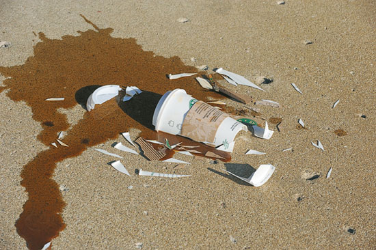 ‘shattered coffee cup’ part of the shattered series it was very cold outside when I photographed this, the coffee froze almost instantly.
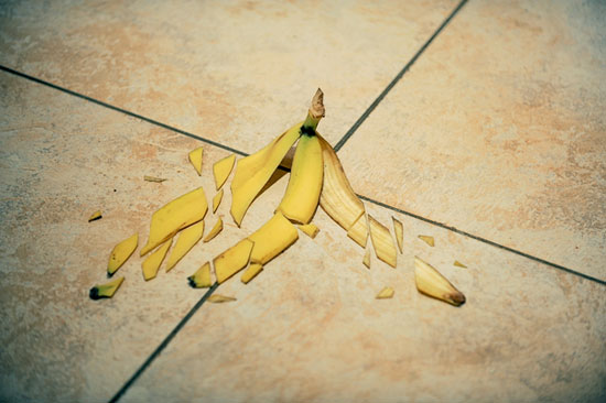 ‘shattered banana peel’ part of the shattered series
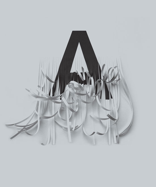 ‘shredded A’ I had thought about making a series of the alphabet with each letter destroyed in some way. I kept imagining the A as being shredded. so I printed out the A and hand cut the strips with a exacto. I then photographed the A resulting in this image. the font is akzidenz-grotesk, one of my favorites.
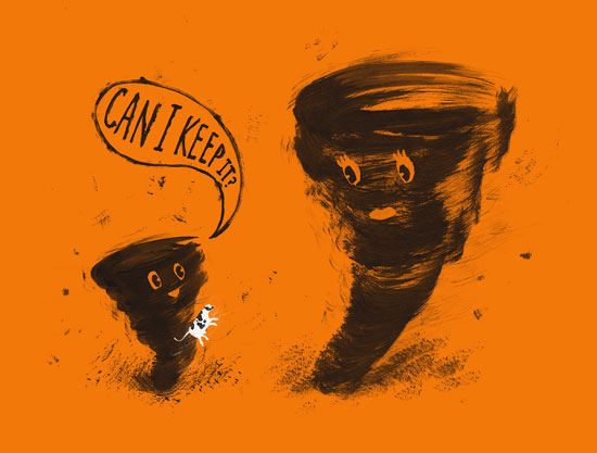 ‘boynado’ I just loved the idea of a little boy tornado finding a cow and asking his mother if he could keep it as a pet.
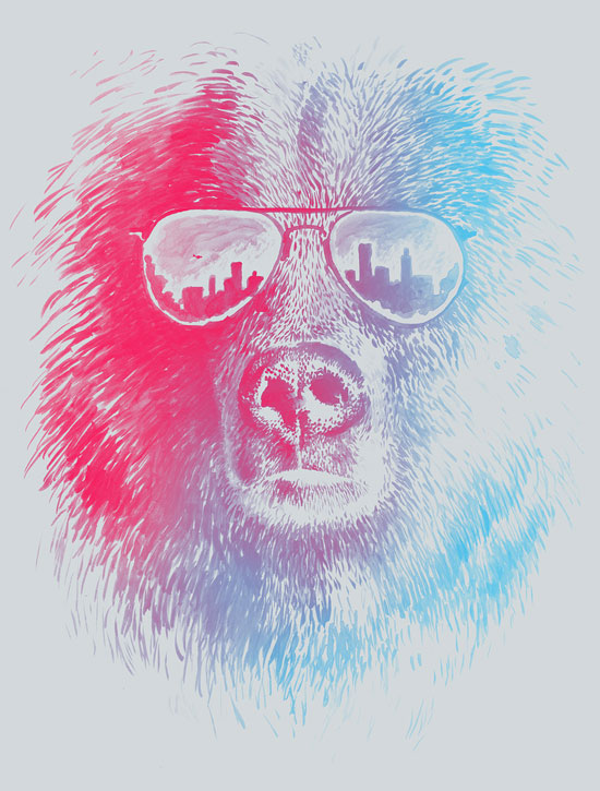 ‘call of the wild’ I had recently seen a movie poster for an old chuck norris film called ‘good guys wear black’ which shows a picture of norris wearing shades like this. I then thought of this idea, putting the glasses on a bear with the city reflected in them. I wanted to suggest the bear at the cusp of modern civilization, about to boldly enter into an unknown territory. perhaps the shades are his wayof trying to fit in, or maybe he just thinks they make him look cool.
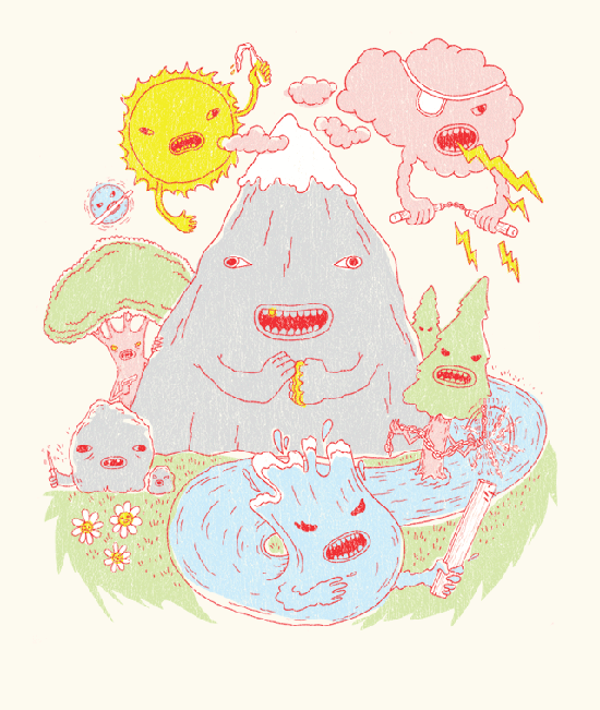
‘roughin’ it’ originally, this was a visual idea I had for a subaru ad. I thought it would be a nice press ad for one of their off-road SUVs. the mountain, forests, clouds, stream, sun, rocks would be weilding weapons and ecouraging the car owner to ‘bring it on’.
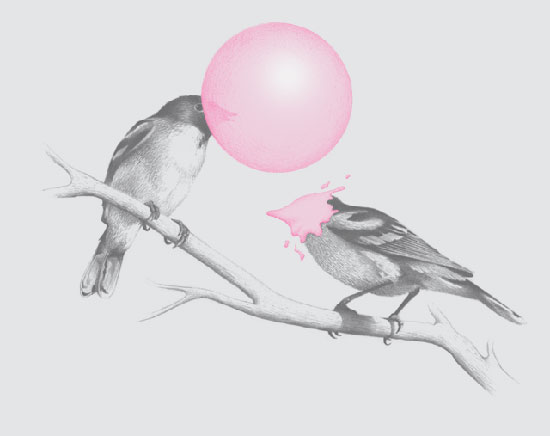 ‘the northern black-capped gumchewer’ I thought of this design while looking through a bird identification book. the book was filled with detailed illustrations. I liked the idea of there being a species of bird that chewed gum and blew bubbles. I felt that executing this image using the detailed style of the drawings in the book, would serve up the humor in a more sophisticated and intelligent way.
brock davis (3)
carmichael lynch (3)
 May 14, 2012
 Feb 18, 2026
 Jan 28, 2026
 Jan 02, 2026
 Dec 28, 2025