Responsive Tile (edited version) by isabel paiva from portugal
designer's own words:
Motivation
++++++++
Responsive tile is a collaborative project developed by two designers and one engineer with different cultural background and nationalities. This project results from curiosity and discussion about cultural differences, but mostly from the surprising encounter of shared experience. In our case, what stood out were environmental issues, and the fact that water scarcity is both a problem in Texas (and southern states of USA) but also in Southern Europe.
The fact of water scarcity being an urgent problem that extends beyond borders led us to extend our research beyond our geographic framing.
We realized that drought ,despite being a problem with great economic and humanitarian impacts, is only dramatically visible -by changes in natural landscape - in rural areas, the visibility greatly diminished in urban contexts. This invisibility of drought in urban contexts creates a sense of distance and disconnection from the problem.
Solution
++++++
Our proposal is to create a communication device that visually conveys water scarcity. This object, a responsive tile, would emulate natural response by reacting and changing, in shapes and colors, according to environmental change. We determine that rising temperatures would be used as the marker to create a warning sign, visually informing people to start saving water.
Our communication strategy is adding a surprising behavior to a common object in the public space, which may generate curiosity as to its meaning. By placing the device in public spaces, we aim to promote awareness in a playful manner that can ultimately make people more sensitive to water conservation. Thus, this object will communicate indirectly through innuendo and symbolic language, that which is a trans-national and tran-scultural issue. We arrived at the this concept through ethnographic research and experimentation with smart inks and prototyping.
Research and Design
++++++++++++++++++
The symbol (Y)
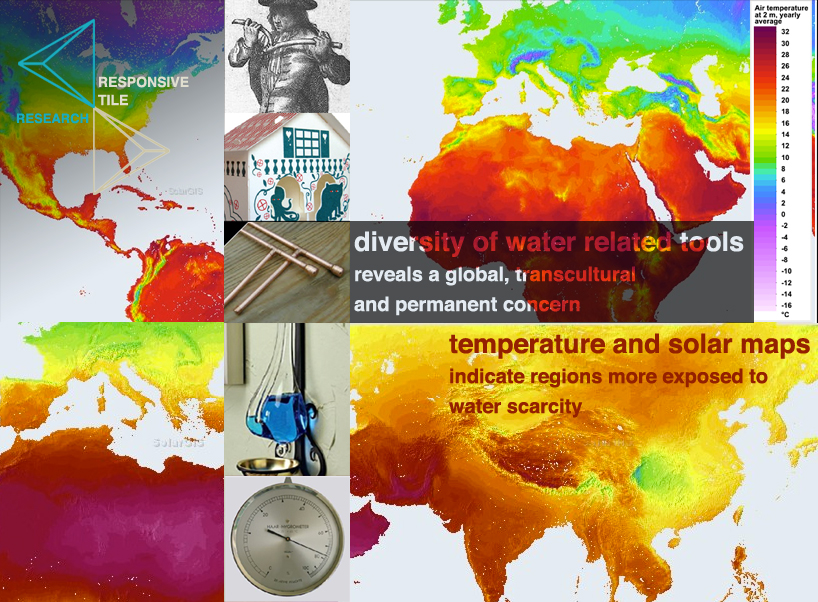
While searching for water finding related objects, we found that the dowsing stick (which is an ethnographic tool to locate water) is present in many cultures around the world. Beyond the discussion of its real utility, we considered that it is a (magical) mediation tool which express a concern in the quest for water, which has high significance being a recognizable (tool) symbol worldwide. As to this we decided to adopt its shape (a Y shaped stick) to our design.
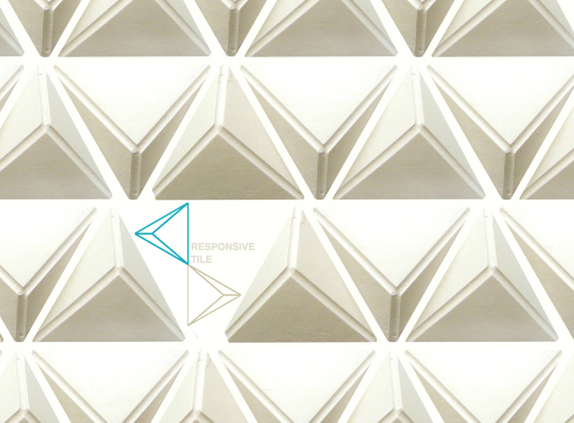
The object design (TILE)
As an object we chose to design a Responsive Tile. First, it is a modular object that can be combined to be a wall, but also function individually. But also, tiles surfacing is a tradition in Mediterranean architecture countries, as a cultural heritage but particularly as a weather adaptation. Tiles have isolating properties, refreshing environments beyond its aesthetical purposes. Nowadays tiles are used worldwide, as for instance in Brasil (Neymeir [1] ) uses in architecture.
We adopted a triangular base tile, designed from the Y shape. It was made in a 3d (pyramidal) shape to better drive water to the soil though its negative spaces. Also the Y surface ( which is embossed in a negative space), allows to drive water through.
Thermocromic inks (reactive) plus ceramic ink (non/reactive)
We decided that the interactive tile would interact with the environment and information would be communicated through changing colors. A thermocromic ink that react to heat and is reversible was our chosen material to obtain the response mechanism. Moreover, we need to work with a combination of thermocromic inks and ceramics inks. Our research had to convey and identify the ink technological qualities, in order to design the experience and communication process accordingly.
For instance, regarding the visual effect it is determinant to acknowledge that a thermocromic ink change typically from a color to invisible or lighter color, at a given temperature. We determined that for our project purpose this temperature would be 32 C. In order to get a two-ways combined information device, the Y to is painted with ceramic ink, and the sides of the tile to be in the same color but with a thermocromic ink. When temperature rise above 32 C, the thermocromic ink will disappear, and this is the only moment that the Y would be visible. Thus, responsive tile will work as a low tech sensor, maintaining shifting aesthetical properties. Our proposal for a color for a first prototype would be Brilliant Green 322C (Matsui chromicolor type 35), but this system can be made in a wide range of colors given that there will a tuning between the thermocromic ink and the ceramic ink.
How thermocromic inks work
This type of paint is a mixture of encapsulated liquid crystals. Explained in a simple way, these substances (LCs) are a special state of matter with properties between solids and liquids, as the name suggests.
This type of substances present special optical properties and are often used to modulate the light in electronics and day-to-day technology (for example in LCD-TVs).
Usually, the LCs used in these paints have a cholesteric structure. This means all the molecules are well-oriented in layers and this orientation rotates from layer-to-layer, around the optical axis.
The light passing through the LC suffers a Bragg diffraction due to each layer and the light reflected will have a well defined wavelength, that corresponds to a spectral color, that will be observed.
Changes in the temperature will affect the space between the layers and, consequently, the wavelength reflected will also change and so does the color observed.
Nowadays, it is possible to buy a great diversity of thermocromic inks from different suppliers. There are many colors and temperatures of transition available.
The context of application
Responsive Tile performance will depend on some factors. One of the things we need to determine from the start is the final place for the product.
For instance, focusing only in Europe, according to a solar map, it’s easy to understand that countries in southern Europe have higher irradiation during the year and, consequently, higher air temperatures than other countries.
For example, average temperatures in Portugal [2] during the year vary from 14ºC, to maximum temperatures near the 40ºC in summer. Therefore, thermocromic ink with a transition temperature of 31ºC would operate perfectly to indicate high values of temperature.
In contrast, in northern countries,[3] Finland, for instance, has the maximum value of 30ºC during summer so, a thermocromic ink with transition at 31ºC wouldn’t work that well.
These are two examples which intend to show the importance of determining the placement of the final product before choosing the ink. For future work and other perspectives, this system can be adapted to other weather conditions, becoming site-specific [4] .
Production
+++++++++
Materials List: Styrofoam, Silicon, hydrocal, thermocromic ink (transition temperature 32C/89F, ceramic ink, airbrush, sandpaper, woven.
Manufacturing responsive tile
Sculpt the design (12cm x 12 x 3 cm tile) in Styrofoam with a file and sandpaper, finalizing its design details including the embossed Y pattern.
Make a silicon mold from this shape. Prepare Gypsum Hydrocal plaster mixture and pour into the silicon mold. This solution dries without fire. Take the tile carefully from the mold.
Note: Given that Hydrocal plaster is less durable than ceramic or porcelain, we would reconsider these materials to make the final work.
Ink application
Using a(n) (air)brush, apply homogeneously the thermocromic and ceramic ink in the ceramic surface.
Pre-heat the oven. Set the tile in the oven at 200ºC during 8 minutes.
Apply varnish on the surface. Depending on the amount of varnish used, wait 3 minutes between each application.
Drying times depend on the varnish used, but usually never less than 2 hours.
Note: it is strongly advised the use of varnish in order to prevent paint degradation due to external factors, such as wind and friction. This way, the paint will last longer. Thermocromic ink can be painted over the ceramic ink.
Ink suppliers
++++++++++
http://www.matsui-color.com/
http://www.lcrhallcrest.com/chameleoninks/thermochromic-reversibles.php
http://www.zenit-konst.se/
http://www.siltechlimited.com/thermallysensitive.aspx
References
+++++++++
Images (selected):
Drought Texas – Time magazine, November 2011
Drought Portugal – Jornal Publico, March 2013
http://www.publico.pt/ciencia/noticia/portugal-devera-ter-menos-25-de-capacidade-para-produzir-energia-hidrica-apos-2070-1587907
References (selected):
[1] Niemeyer tiles
https://www.google.pt/search?q=niemeyer+tiles&espv=210&es_sm=91&tbm=isch&tbo=u&source=univ&sa=X&ei=0D5dUpaHBIOqtAb9ooHoBg&ved=0CEkQsAQ&biw=1280&bih=729&dpr=1
[2] Portugal air temperature
http://www.pordata.pt/Portugal/Temperatura+media+do+ar+(media+anual)-1067
[3] Worlwide weather online
http://www.worldweatheronline.com/Helsinki-weather-averages/Southern-Finland/FI.aspx
[4] Irradiation and temperature maps
http://solargis.info/doc/_pics/postermaps/SolarGIS-solar-map-EU-ghi.png
intro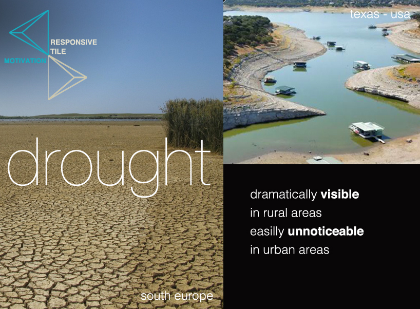
motivation
[jwplayer config=”mplayer” width=”818px” height=”600px” file=”https://static.designboom.com/wp-content/compsub/152831/2013-10-15/video_1_1381863675_fa763098e047d41b12f58e87c11a6add.mp4″ html5_file=”https://static.designboom.com/wp-content/compsub/152831/2013-10-15/video_1_1381863675_fa763098e047d41b12f58e87c11a6add.mp4″ download_file=”https://static.designboom.com/wp-content/compsub/152831/2013-10-15/video_1_1381863675_fa763098e047d41b12f58e87c11a6add.mp4″]
video
research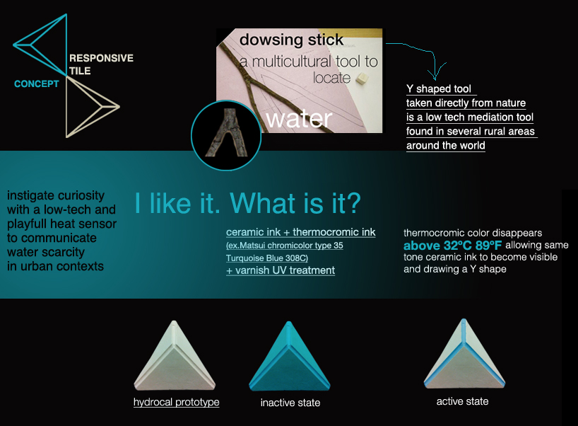
design concept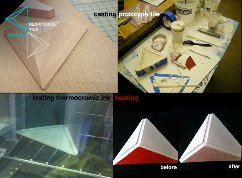
fabrication process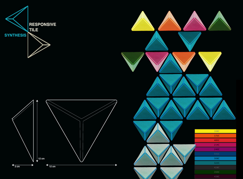
synthesis – responsive tile wall + technical drawings