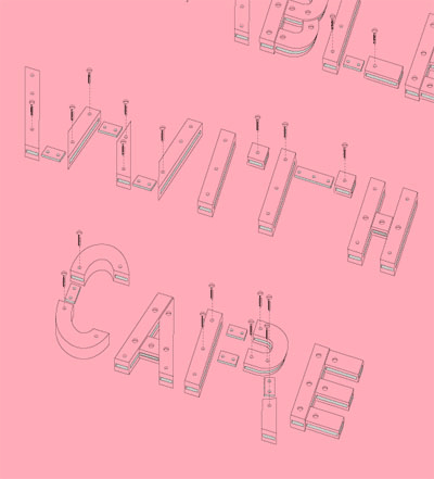
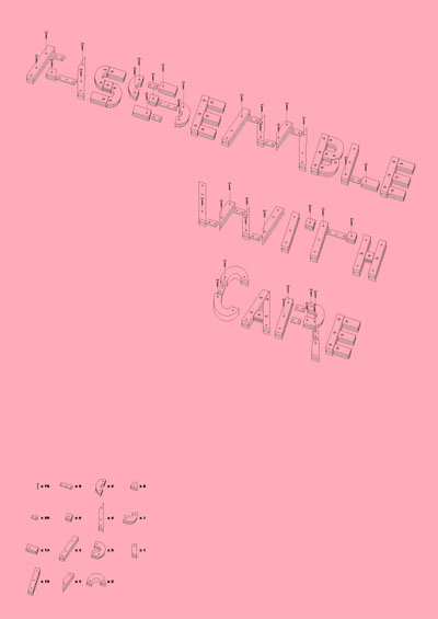
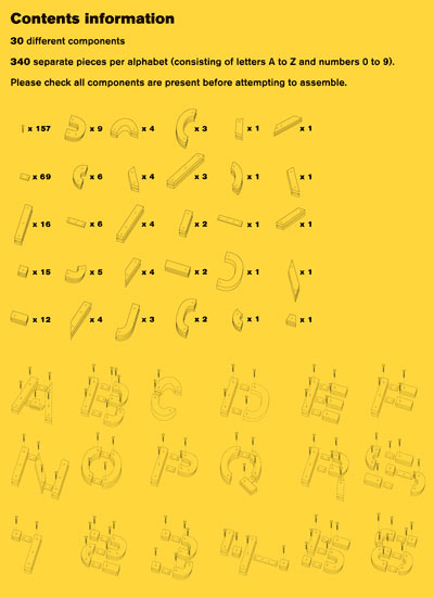
this project by jamie hearn combines the classic IKEA exploded diagram style with typography. hearn is a graphic design student at central saint martins, london. more images and info can be found over at johnson banks’ ‘thought for the week’.
KEEP UP WITH OUR DAILY AND WEEKLY NEWSLETTERS
typography design (133)
 Sep 13, 2023
 Feb 23, 2023
 Jan 24, 2023
 Jan 19, 2023
 Apr 16, 2025
uncover the colorful legacy of italy's iconic train, designed by gio ponti and giulio minoletti in the '50s.
connections: +110
 Apr 14, 2025
unveiled as well at the italian pavilion in expo 2025 osaka, the design uses fuel coming from cooking oils and animal fats.
connections: +190
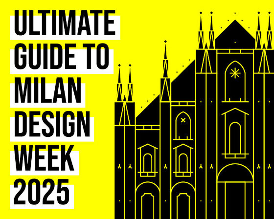 Apr 08, 2025
discover our guide to milan design week 2025, the week in the calendar where the design world converges on the italian city.
connections: 74
 Apr 07, 2025
'there is no real, defined space, there’s just the reflection’ – designboom speaks with Hermès artistic directors charlotte macaux perelman and alexis fabry.