
the news of world-renowned color authority pantone picking its color of the year is always hotly-anticipated, and this year was no exception. the ‘complex and contemplative’ ‘ultra violet’ is the 2018 selection, and is symbolic of ‘what is possible and continues to inspire the desire to pursue a world beyond our own.’
custom printing specialists pixartprinting spoke with laurie pressman, vice-president of the pantone color institute about the highly-anticipated announcement, the research that goes into creating a new shade, and what color means to her.
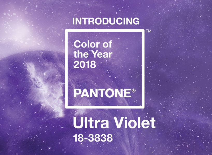
pantone announced ‘ultra violet’ as 2018 color of the year
read more on designboom here
what research goes into creating a new color?
laurie pressman (LP): with an emphasis on ensuring our color palettes are fresh and relevant to the markets we serve, color trends are a major component factoring into the selection and then physical creation of new colors that get added into our different pantone color system palettes. our global team of trend forecasters, coupled with view publications partnership where we produce our pantoneview color trend forecast two years ahead of the season, give us insight into the colors in their specific tints and tones that will be important across design in the future. the ability to glean these insights and quickly react keep us one step ahead and enable our clients to apply these colors to their brand or products, in line with consumer demand.
‘ultra violet’ is described as ‘inventive’ and ‘imaginative’ by the pantone color institute
pantone has some 32,000 unique color IDs and counting. your own research suggests that choosing a color is 95% emotional and 5% rational. what research (into psychology, socioeconomics, perception) has ‘categorized’ this emotivity and translated it into a universal color system like pantone’s?
LP: our research, which notes that as much as 95% of consumer decision making is dictated by the subconscious, concludes that it is perception and not logic which drives the majority of consumer purchasing decisions. this research result is not something that can be directly translated into the colors we chose to include within different pantone color system palettes, however, as perception is not tied to any one color but rather to individual preferences.
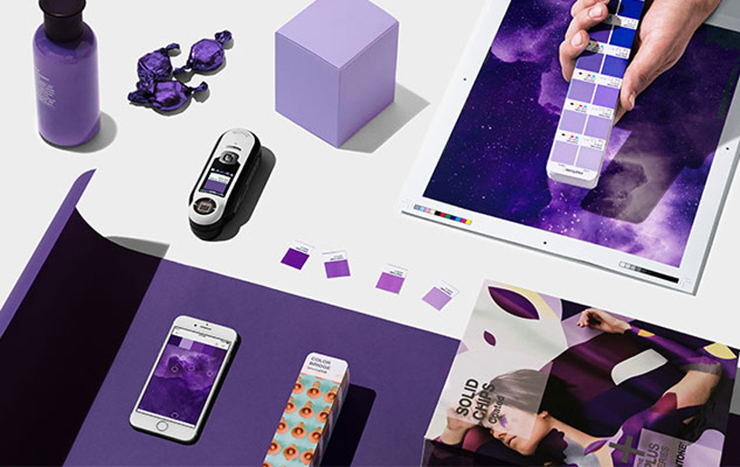
designboom visited pantone’s factory headquarters
read more about the visit on designboom here
image © designboom
LP (continued): with that said, individual preferences are emotional and consumer response to the exact same color can shift over time and based on context. to make sure the color research we compile is current and relevant, our team at the pantone color institute conducts color word association studies on an ongoing basis. additionally, our color association research plays a role in color messages, meanings and how the mixing of colors can create a mood.
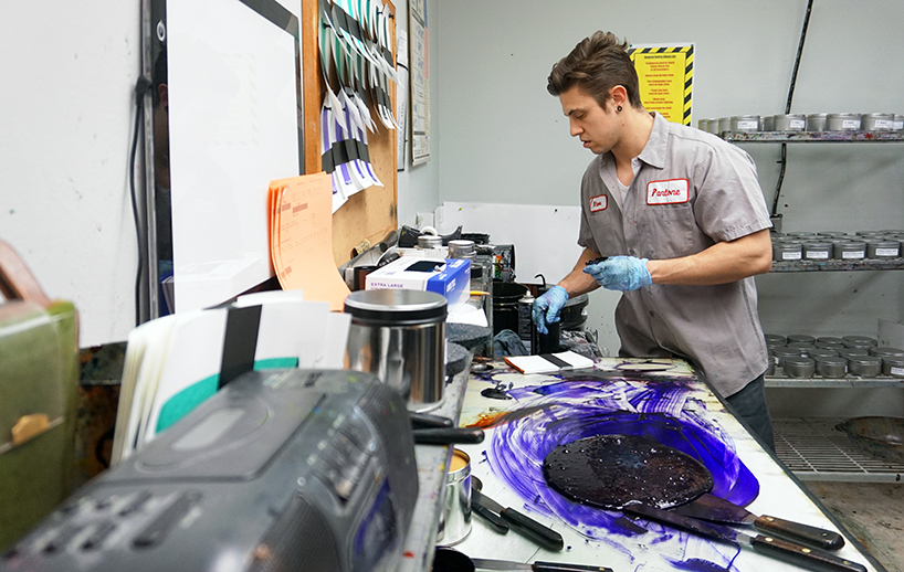
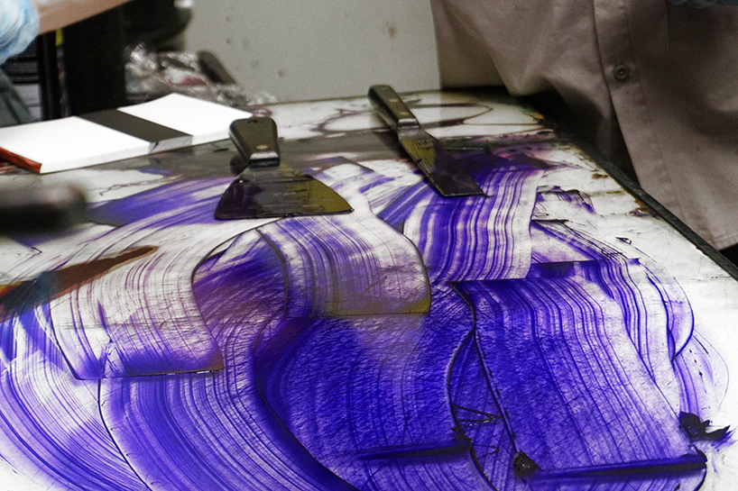
pantone ink technician steve mixes various pigments together
image © designboom
given the subjectivity of color perception, are pantone technicians tested to ensure that they can distinguish between almost imperceptible differences between tones?
LP: it is critically important that any pantone technician involved in making color decisions has the ability to distinguish between almost imperceptible color shade differences. each year they are required to take the farnsworth munsell 100 hue test, a standardized measure of chromatic discrimination that evaluates an individual’s ability to discern color. the test involves the accurate sorting of 85 colored caps into incremental hue variations. a superior score must be achieved to pass this highly difficult test and become a pantone color technician.
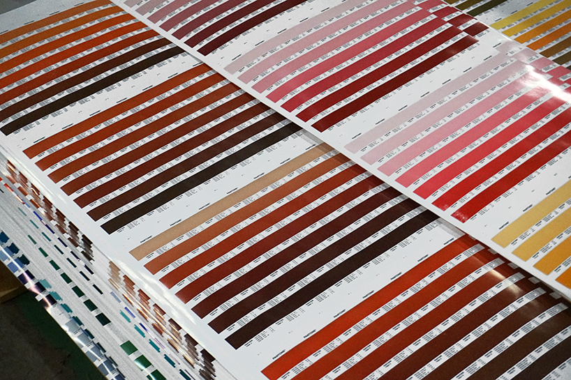
all of the inks are blended by hand
image © designboom
what are the colors you use for printing made from? are they chemical or natural/plant-based colors?
LP: all the inks we use to print our colors are plant based and are made naturally.
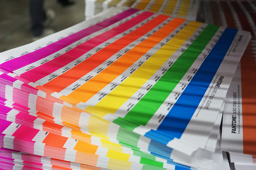
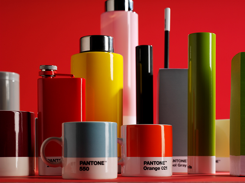
color is everywhere
image © designboom
what criteria do you use to choose the color of the year?
LP: the color we select to be our pantone color of the year is one which we think best communicates what is taking place in our global culture at a moment in time; a color we see crossing all areas of design that serves as an expression of a mood and an attitude on the part of the consumers. the emotional aspect of color is a large aspect of our decision making, as we want to ensure that the colors we select are reflective of the collective mindset. with color and context so intertwined, there really are reasons why a color family or individual color comes into prominence when it does. for the most part, the popularity of a color is symbolic of the age we are living in.
‘popularity of a color is symbolic of the age we are living in,’ pressman says
LP (continued): for our team at the pantone color institute, this is a process that requires thoughtful consideration and analysis. to arrive at the selection each year, our team at the pantone color institute comb the world, actively searching for general lifestyle color trends and new color influences for our seasonal color trend forecast reports. at the same time, we look out for the color that we see as ascending, and seems to be building in importance across all areas of design. some of the areas we look to for insight include the entertainment industry and films in production, traveling art collections and new artists, street art/street style, fashion, all areas of design, popular travel destinations, as well as new lifestyles, playstyles and socio-economic conditions. influences may also stem from new technologies, materials, textures and effects that impact color, relevant social media platforms and even up-coming sporting events that capture worldwide attention.
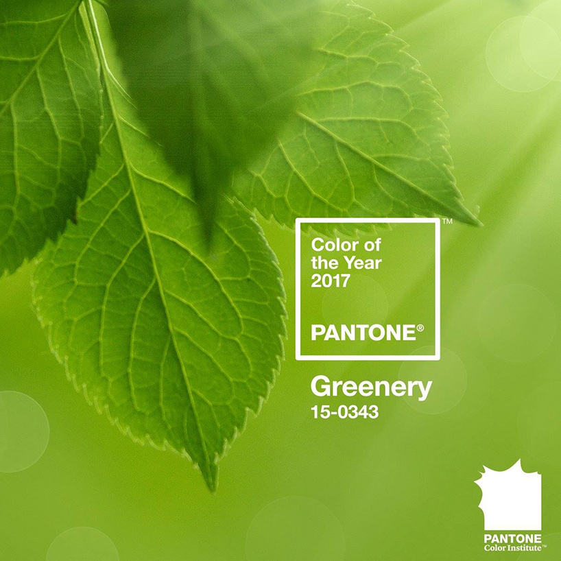
pantone reveals the color of the year for 2017 | read more on designboom here
how many alternatives are considered before the definitive color is selected?
LP: colors build in importance. it is only very rarely that we see a color become an immediate sensation overnight. keeping this in mind, typically the color family, and sometimes even the color we select as pantone color of the year, has been on our radar the year before. but it did not get chosen, as we did not view it as the one color that was really pushing through, or as the single shade we think had the ability to communicate the color message that best reflected what was taking place in our culture at a moment in time.
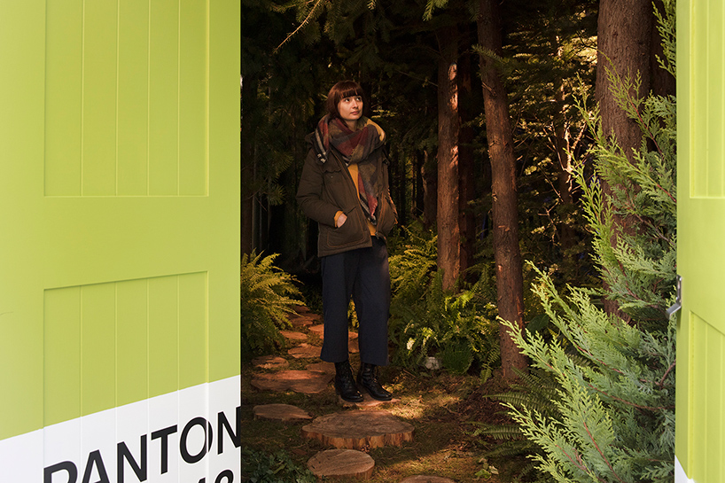
airbnb and pantone brought a bookable, greenery-themed apartment to life in london
read more on designboom here
your decisions have a major influence on the design world. how did you become such an authority?
LP: pantone has been in the business of color for 55 years. we began in 1963 as a color language standard of 10 colors intended to enable accurate reproduction of color for the print industry. today we serve millions of clients around the world as a source of inspiration for the global design community; helping them to select, communicate and control color across every imaginable surface and material. we became an authority through our focus and dedication on the business of color; developing tools and services that help the designer realize his creative vision. in so doing, we continue to build a unique worldwide presence as a one stop shop for all things color related.
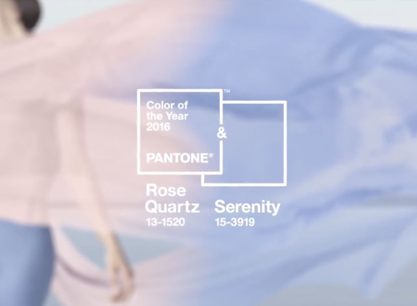
in 2016, pantone — for the first time — chose two shades for color of the year: rose quartz and serenity
read more about it on designboom here
what does color mean for you?
LP: I am a color lover. for me color is life; it is expression; it is freedom. color engages. color defines. color is the first thing we see when we open our eyes; it creates the magic and the mood. tied to our other senses, color can be tantalizingly suggestive of scent and can even be so evocative that our mouth might water just by seeing a particular color. without color, life could be a vision of black and white. and while quite beautiful and dramatic, for me personally a life without color would not be enough to capture the essence and bounty of all that life has to offer.
happening now! in an exclusive interview with designbooom, CMP design studio reveals the backstory of woven chair griante — a collection that celebrates twenty years of Pedrali’s establishment of its wooden division.
pantone (44)
 Dec 05, 2024
 Dec 07, 2023
 May 07, 2023
 Dec 02, 2022
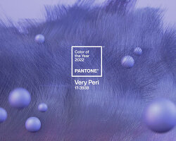 Dec 09, 2021
 Apr 16, 2025
 Apr 14, 2025
 Apr 08, 2025
 Apr 07, 2025