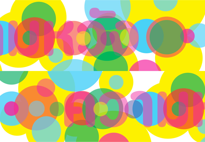
top image: bangkok hope billboard
erik brandt is a graphic designer and educator who has been active internationally since 1994. he is currently a professor at MCAD (minneapolis college of art and design) in minneapolis, minnesota and will be serving as chair of the design department until 2015. educated internationally, his creative and research interests focus on issues of globalization that affect and drive the complexities of inter-cultural visual communication systems. in 2012, he was made a member of the AGI (alliance graphique internationale).
DB: please could you tell us about your background and the evolution of your studio?EB: my background is a bit eclectic, I grew up all over the world speaking several different languages. my family spent time in cameroon and malawi, but my formative years were spent in germany and egypt. I finished my secondary education in cairo and returned to the us for my undergraduate studies. these were postponed by a brief stint as a bicycle messenger in washington DC in the late 80’s. after being struck by a large moving vehicle for the third time, I reflected on the viability of that career and returned to complete a degree in philosophy at the college of william & mary.
after returning to germany for a teaching position, I found my way to fukuoka, japan where a comic I had been drawing for friends was picked up by an english-language monthly called radar. I started writing and editing for them and eventually became the editor. that’s where my awkward start with graphic design began, learning quark with japanese characters.
I returned again to the US and was accepted for MFA work at virginia commonwealth university (VCU) where I spent two very difficult but exhilarating years under the tutelage of my teachers akira ouchi, john malinoski, rob carter, ben day, and mary mclaughlin. my work truly came into being and flourished there.
I took a teaching position shortly after completing my thesis work and formed my small studio, ¡ü16.øäk!. balancing teaching and studio practice led me to focus largely on cultural work and this has remained true through today. the conglomerate identity reflected in the initial studio name remains, but I have since settled on typografika as it echoes old czech typographic unions and nicely encapsulates the dominant typographic nature of my work. I also author the blog, geotypografika (visual communication und wissenschaft).
 powderhorn flag
DB: which have been your most satisfying projects to date?it’s actually a really difficult question! there is the fukuda homage and the shoebox identity, or the VCU chair search poster and vidtiger work. I’ve also really enjoyed the printed matter I made for the eyeo festival and works progress here in minneapolis, both allowed for a large-scale application of ideas and graphic treatments.
if I look back I can see projects that I absolutely loved at the time, but now can see some faults, but I suppose that’s always true for anyone that makes things. it’s better to look forward and be wary of too much comfort, I have sensed that approaching in my work and am busy trying to break from it.
right now I am really excited about a new project I have started, predictably titled ficciones typografika. I constructed a 72″ x 36″ poster board which can host three 24″ x 36″ posters at a time. I attached this to my garage which faces the street in our neighborhood. I am inviting designers and artists from all over the world to submit work, and am also regularly posting my own experiments there. the project has it’s own tumblr, ficciones typografika, and I am working hard to develop momentum around it.
 two variations of the shoebox gallery logotype
DB: could you tell us about your ongoing collaboration with your wife poet elisabeth workman?EB: it has been wonderful. I am especially proud of an early piece we made together while living in qatar, a pamphlet collection of her poetry and my photography called opolis. it was printed with green ink on translucent paper, yellow, blue, white, and my favorite, pink. more recently, we collaborated on a large piece using an anagram she discovered, strictly american, scarcity terminal.
DB: is there a particular type of project that you enjoy, or would like to work on?EB: really enjoy large-scale systems problems, these include books or identity systems, event collateral. I love the challenge of large data sets and trying to create a cohesive, if sometimes disconsonant, whole. this suits me because of my third-culture identity; I enjoy dissecting and creating conglomerates because that’s how I identify myself. I’ve been producing work around this idea for many years now. this approach has also informed my teaching, I never try to impose my own aesthetics on my students, instead, I try to elicit and develop idiosyncrasy where possible.
 ficciones typografika – experiment with letraset

ficciones typografika – experiment with letraset
 ficciones typografika – experiment with letraset
DB: do you think it’s important for a graphic designer to be able to draw?EB: my teacher akira would have insisted, yes, absolutely, and I agree to some extent. that’s how his generation and mine produced our ideas, but I am not sure if that is still true today. I sometimes see students and practitioners lost searching for answers in software, and I still find the best way to reach the soul of a piece is in quick sketches and simply becoming lost in the possibilities. formal ideas have to be related to a cultural and historical framework. there is everything to be said for a fascination with the world and a yearning for new learning and discovery. it can’t always be about drawing. I think the flexibility of thinking that I found through the study of literature, history, and philosophy is still the dominant energy behind my work. then again, for me, developing form around those ideas still involves a pencil.
DB: how do you see the future of the poster in a time where people increasingly get their information from the screen?EB: well, the ‘pedestrian zone’ is being replaced by the walkways of the internet. in the physical world, I still think that, with the us as an obvious exception, the poster thrives all over the world. even online, the static surface and scale of the classic vertical rectangle obviously thrive, see the success of tumblr or even the reorientation of photography to vertical formats largely due to smartphones.
 para fukuda poster – hommage to shigeo fukuda
 eyeo festival poster
 VCU chair poster
 works progress poster
DB: who or what has been the biggest influence on your taste in color and typography?EB: my teacher, akira ouchi. he was a master of detail and an inexhaustible resource of wonder, imagination, and possibility. we often went fishing in the james river together, and I think I learned more about graphic design from him there without ever speaking of it. he always talked about analyzing color in terms of its taste, quite literally. he talked about how two people could enjoy a meal together without speaking, only enjoying taste and color. he also taught me how to care for type, to truly be concerned and generous with these simple yet infinitely variable objects. he was a light that I hope is still reflected in my work today.
 enter the dragon poster – a collaboration with elisabeth workman(each line is an anagram of ‘enter the dragon’)
 post cards for a solo exhibition of brandt’s work
 like tears in rainbows – centerfold design for CRACK magazine
 link data disks poster – more info
 ‘a living picture of meeting house square’ poster for richard torchia
DB: how do you think the popularity of online design resources has influenced design being produced today?EB: it has only accelerated the development and perpetuation of trends. some time ago it seemed that software filters etc. were starting to determine trends. people used to joke about design awards going to whoever got their hands on the new filter first. what we’ve been seeing in the past two years or so is similar, what gestalten has called ‘pretty ugly’, but an important difference I sense is that these trends are essentially formally based, and I love that. yes, these forms are trendy or fashionable but the younger designers today are inspired by basic formal issues of point, line, and plane again. they are curious and passionate about typography. if they fall victim to dominant trends or fashion, well, has that really been any different in the past? everyone starts somewhere, and it’s exciting to see these old values being expressed in such vibrant ways today. some might not be able to see past the aesthetics, or even grant them that definition, but I am encouraged by this celebration of the possibilities of form.
 erik brandt with his daughter beatrix
DB: what is the best piece of advice you have ever been given? EB: never say never.
DB: what is the worst piece of advice you have ever been given?EB: never say never.
graphic studio interviews (193)
 Nov 21, 2022
 Feb 10, 2019
 Jun 21, 2018
 May 17, 2018
 Oct 04, 2017
 Feb 18, 2026
 Jan 28, 2026
 Jan 02, 2026
 Dec 28, 2025