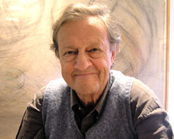
tom geismar is a founding partner of chermayeff & geismar and widely considered a pioneer of american graphic design. designboom recently spoke to tom about his work and the art of logo design.
DB: besides design, what are you passionate about and how does it feed into your work? TG: family, art, architecture, advertising, movies, sports, what’s happening in the world, and toy robots. all these interests feed into all aspects of my work, in subtle ways and explicit ways.
what is the attraction of designing logos for you? I have always been attracted to reductive design, trying to find the essence of an idea, and then finding an imaginative way to clearly express it. that approach is quite relevant to logo design, especially the design of symbols and marks. I have also always loved type and typography, and designing letter forms, and that is certainly relevant to the design of wordmarks. I also like the fact that logos don’t get thrown out with the trash, as does so much of graphic design.
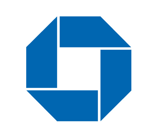 the symbol for chase, originally designed for the merger of chase national bank and the bank of the manhattan company, has survived over four decades of mergers and acquisitions. 1961
how have the various partners / collaborators you and ivan have worked with influenced the studio’s work over the years? we have collaborated with many talented people over the years, and they have made significant contributions to many of the projects we have undertaken. some of our partners have been graphic designers, others architects, so the areas of collaboration have varied. our new young partner sagi haviv contributes greatly to most of our recent projects, and has helped expand our range of clients and our access to new media.
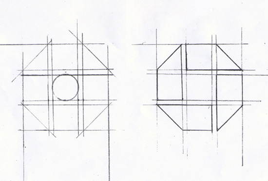 sketches from design of the chase logo. 1960
when chermayeff & geismar receive a brief from a client, how does the project usually unfold? we are all designers, and try to do it all ourselves. circumstances, friendships or interest often determine who takes the lead with any one project. we work collaboratively, but differently. I spend a lot of time analyzing the problem, talking with the client, and trying to define the relevant issues before putting pencil to paper, and then I usually study many design alternatives. ivan on the other hand, often has an immediate design response, without bothering with all the foreplay. sagi is somewhere in-between.
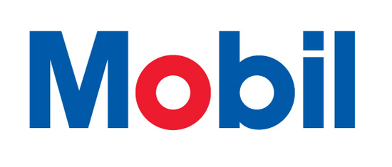 the mobil logo features a red ‘o’ to give it distinction and to continue their historic use of color. 1964
which of your designs are you most proud of, and why? I have spent at least half my time over the years designing, and to some extent curating, exhibitions for museums, world’s fairs and other public attractions. I particularly enjoy those projects because they require becoming deeply involved in the subject matter, which is inevitably interesting, and I enjoy the challenge of devising compelling ways to express complex ideas. designing logos requires a different kind of involvement, though one that’s no less intense. each is part of a larger design strategy, and I am most proud of those projects, such as mobil, where I was able to design not only the logo and a special alphabet, but also an extensive design program that kept us very involved for some 30 years.
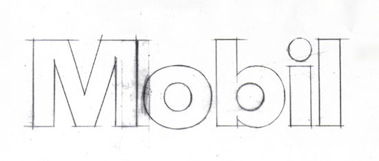 early sketch for mobil logo. 1964
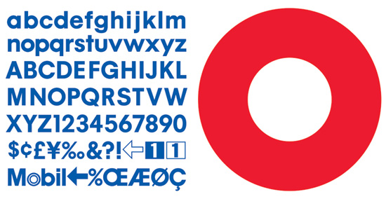
proprietary alphabet designed for mobil, and used for all signs, titles, packaging and advertisements. 1964
what criteria do you evaluate your logo designs against? we always strive to develop designs that are appropriate to the client, workable in a range of media, and memorable. we try very hard not to be fashionable, in that it’s usually desirable for a logo to remain vibrant and relevant over a long time period, and fashions tend to become unfashionable pretty quickly.
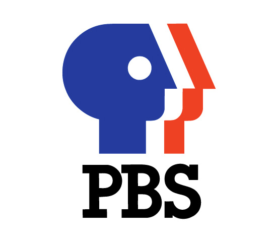 logo for PBS depicts the idea of ‘everyman’ for public television. 1984
given your experience, are you able to finalize a logo design much quicker than you used to, or does it remain a matter of trial and error? age and experience don’t seem to have had much effect for me personally in terms of efficiency. sometimes an idea comes quickly, but we follow the same basic process for all projects, and often it is still a matter of trying out a range of options to find the best one. each project remains challenging, and maybe that’s a good thing.
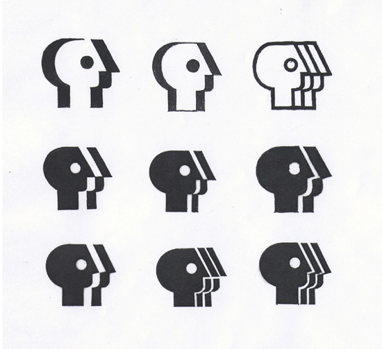 alternate study sketches for PBS logo. 1984
are there any of your logos that you would like to modify? or that you can see ‘imperfections’ in, which other people might not notice? with any design it takes about a year before you can look at it in a fresh way. I’d more often like to tweak (or sometimes radically modify) the way the logo is being implemented more than the mark itself. on the other hand, it’s always a pleasure to see your intent carried out in a good way. for example, I think the designers at PBS actually improved the mark I designed many years ago by putting it in a shape, and the crew at armani exchnge has been using the bolder new A/X we recently developed in a very strong, effective manner.
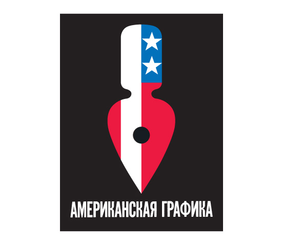 poster for graphic arts USA, an exhibit of american graphics that toured the soviet union. 1963
do you think it’s important for a graphic designer to be able to draw? I think it’s a matter of how you learned and what one feels most comfortable with. while I spend much time on the computer, and find it a great tool for carrying out design directions, to me drawing is still absolutely essential as a way to quickly convey or express an idea. it’s especially important for us, as our work is idea-based, not style-based.
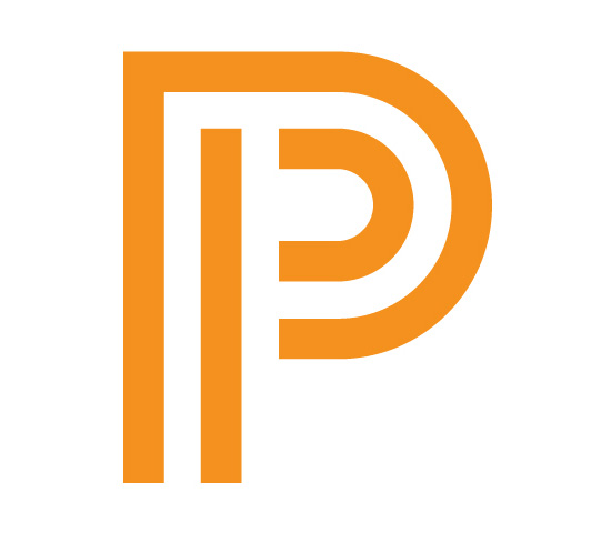 symbol for princeton university press. 2008
given the many factors that contribute to a brand’s identity how important do you consider a logo to be? as the question implies, the logo is only one part of any organization’s ‘identity’. the logo essentially helps people clearly identify the entity. but over time the logo inevitably takes on, or rather stands for, those other characteristics that make up ‘identity’. as with national flags, it becomes almost impossible to separate the pure logo design from all of one’s feelings about the entity it represents.
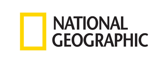 logo for national geographic and its various media outlets. 2001
do you have any preference of symbols over wordmarks? not at all. each situation requires an appropriate direction, and symbols and wordmarks serve different purposes. if the name is short and memorable, a wordmark is often the best choice, but if the name is long and cumbersome, or if there are many related but separate entities, using a symbol to tie them together may be a better direction.
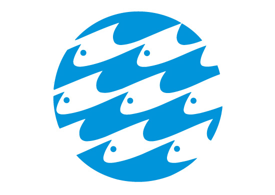 logo for the national aquarium in baltimore reflects the dual themes of fish and water. 1980
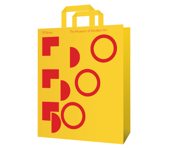
shopping bag design with logo celebrating the 50th anniversary of the museum of modern art. 1979
how have the emergence of new media platforms changed your approach to designing identity schemes? our basic approach has not changed, but the easy availability of color and animation are now essential considerations in the design of logos, and in weighing how they might be used. logo ideas that we once thought applicable only to media companies can now be considered for a much broader spectrum of institutions.
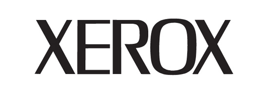 logo for xerox emphasizes the unique name. 1967
what mistakes or ‘traps’ should a young designer avoid when working on a logo design? – not properly analyzing the real need – trying to convey too much – being too concerned with making something ‘pretty’ – designing something that’s too much like other logos, and therefore not distinctive – not taking into consideration the range of media in which it will mostly be used – not being critical enough of your own work
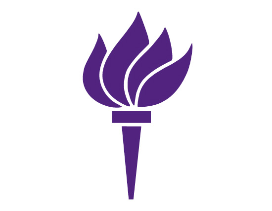 torch symbol for new york university, an update of their traditional torch runner. 1972
tom geismar since 1957 he has designed more than a hundred corporate identity programs. his designs for xerox, chase manhattan bank, best products, gemini consulting, PBS, univision, rockefeller center and, most notably, mobil oil have received worldwide acclaim. tom has also had major responsibility for many of chermayeff & geismar’s exhibition designs and world’s fair pavilions.
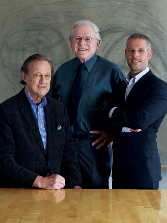 left to right: ivan chermayeff, tom geismar, sagi haviv
his projects include major tourist attractions such as the ellis island immigration museum, the statue of liberty museum, the truman presidential library, and the redesigned star-spangled banner exhibition at the smithsonian national museum of american history. he has received all the major awards in the field, including one of the first presidential design awards for helping to establish a national system of standardized transportation symbols.
tom geismar concurrently attended the rhode island school of design and brown university. a phi beta kappa graduate of brown, he received a master’s degree in graphic design from yale university, school of art and architecture.
— all images courtesy of chermayeff & geismar
chermayeff and geismar (9)

logo design (247)
 Aug 09, 2024
 Jul 03, 2024
 May 22, 2025
 Apr 16, 2025
 Apr 14, 2025
 Apr 08, 2025